 Redmine Logo?
Added by Jim Mulholland about 18 years ago
Our team was going to create a Redmine Mac OS X Fluid webapp. However, we were not sure what the logo should be to symbolize Redmine on our Mac dock.
Does Redmine have an official logo?
Replies (119)
 RE: Redmine Logo?
-
Added by Jean-François Boutier almost 18 years ago
RE: Redmine Logo?
-
Added by Jean-François Boutier almost 18 years ago
Thanks to the ones who can to remove the bad link in my last post.
 RE: Redmine Logo?
-
Added by Jean-Philippe Lang almost 18 years ago
RE: Redmine Logo?
-
Added by Jean-Philippe Lang almost 18 years ago
Hi Jef,
I've fixed the link. This one is cool :-)
 RE: Redmine Logo?
-
Added by Martin Herr almost 18 years ago
RE: Redmine Logo?
-
Added by Martin Herr almost 18 years ago
Hey guys,
check out my redmine logo draft I did some weeks ago..
| redmine_logo_v1.png (11.8 KB) redmine_logo_v1.png |
RE: Redmine Logo?
-
Added by Martin Herr almost 18 years ago
Thanks Wynn! :) here's just a template example using the same colors for the official redmine website..
 RE: Redmine Logo?
-
Added by Wynn Netherland almost 18 years ago
RE: Redmine Logo?
-
Added by Wynn Netherland almost 18 years ago
I'm really digging it, Martin! Simple, elegant and captures the literal meaning of the name!
 RE: Redmine Logo?
-
Added by Kit Plummer almost 18 years ago
RE: Redmine Logo?
-
Added by Kit Plummer almost 18 years ago
I, too, like Martin's efforts. Very well done.
I prefer the white background and red gradients - over the red background (that's a lot of red).
RE: Redmine Logo?
-
Added by Jim Mulholland almost 18 years ago
Nicely done, Martin!
I too really like how you kept the logo very simple yet it clearly symbolizes Redmine.
RE: Redmine Logo?
-
Added by Martin Herr almost 18 years ago
Template Example v2 - without lot of red ;)
 RE: Redmine Logo?
-
Added by Eric Davis almost 18 years ago
RE: Redmine Logo?
-
Added by Eric Davis almost 18 years ago
Template Example v2 reminds me of Trac a little too much. The logo looks great though.
Eric
 RE: Redmine Logo?
-
Added by Anonymous almost 18 years ago
RE: Redmine Logo?
-
Added by Anonymous almost 18 years ago
Martin, beautifully done. Love the logo!
Hans-Peter
RE: Redmine Logo?
-
Added by Jean-François Boutier almost 18 years ago
Very nice work Martin !
This figure is simple, clearly identifiable and easely linked to the literal meaning.
Should be adopted.
Jef

RE: Redmine Logo?
-
Added by Martin Herr almost 18 years ago
Thanks for your comments!
I would like to do some more logo stuff and create a new redmine-default-template - based on my last logo drafts..
@Jean-Phillip: What's your idea regarding the logo? Do you have different ideas or shall I proceed?
Best,
Martin

 RE: Redmine Logo?
-
Added by youngseok yi almost 18 years ago
RE: Redmine Logo?
-
Added by youngseok yi almost 18 years ago
+1 for Martin too.
but, I prefer the lower height of the font "redmine"
RE: Redmine Logo?
-
Added by Jean-Philippe Lang almost 18 years ago
@Jean-Phillip: What's your idea regarding the logo? Do you have different ideas or shall I proceed?
I find it nice. But maybe it could be a little thicker and more rounded. What do you think ?
RE: Redmine Logo?
-
Added by Martin Herr almost 18 years ago
ok. I did some different logo drafts. Please choose your favorite one and post it here!
Btw I used open source fonts called "share" and "Delicious" for these drafts -> I think it's important that we do not use a commercial font to avoid licensing problems..
| redmine_logo_v2.png (48.4 KB) redmine_logo_v2.png |
RE: Redmine Logo?
-
Added by Kit Plummer almost 18 years ago
+2 for #04
+1 for #03
Agree on the font choice. I much prefer the white background. Maybe it is just because red is not may favorite color.
Good stuff man.
Kit
RE: Redmine Logo?
-
Added by Martin Herr almost 18 years ago
hey guys. thanks for your votes!
Regarding the background colors: The logo has to work in both versions (white background with gradients and red or black background). Even if you don't like the red-background ;) it's the best way to do one-color-prints (f.e. on t-shirts). Just take a look at the b/w example:
| redmine_logo_bw.png (6.03 KB) redmine_logo_bw.png |
RE: Redmine Logo?
-
Added by Anonymous almost 18 years ago
+1 for 04. Regarding 'Flexible Project Management': I would prefer the old v2 example way.
Hans-Peter
RE: Redmine Logo?
-
Added by Martin Herr almost 18 years ago
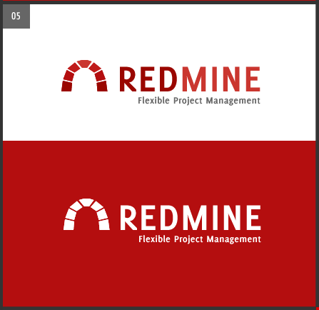
I think the font was too small in my last drafts.. here's my final suggestion No 05 with the Delicious-font and right-aligned subtitle:
| redmine_logo_v5.png (13.9 KB) redmine_logo_v5.png |