Patch #25853
closed
Move left bottom links from project settings above
Description
This patch is related to #24720 where all "New item" links were been moved above the list.
There are three more links left under the list and I think it's better to have them all above the list:
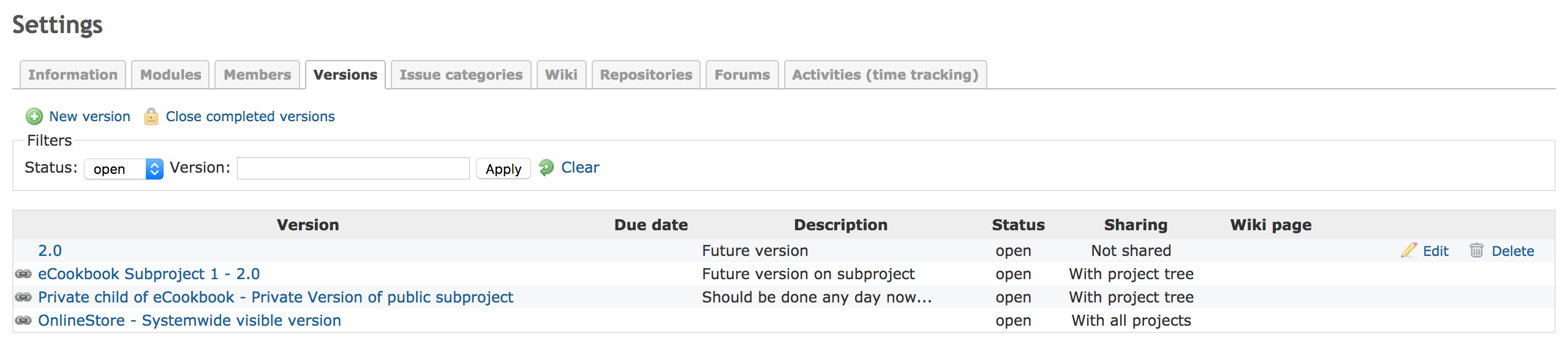
1. "Close completed versions" from Versions tab
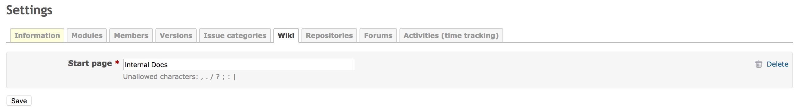
2. "Delete" from Wiki tab
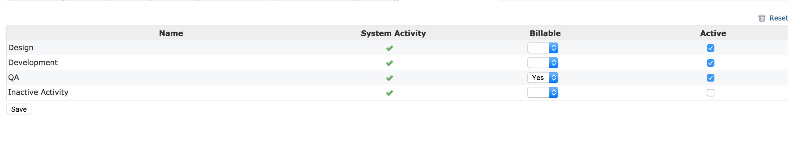
3. "Reset" from Activities tab
I've attached 2 patches:
move_close_completed_versions_above.patch
- adds the "icon" and "icon-lock" classes to the link (the same icon is used for button "Close project")
- adds a class "left" for existing contextual class to let the icons aligned to left (according to the #24720)
move_delete_and_reset_above_the_list.patch
- moves the "Delete" link from wiki tab on the same line with the wiki input field. I find it more natural to be there.
- moves the "Reset" link from activities above the list.
I made this patch after I find out that our users didn't know about the button "Close completed version" which is very well hidden when the projects have many versions.
Files
 Updated by Marius BĂLTEANU almost 7 years ago
- File Screen Shot 2017-05-15 at 22.54.28.png Screen Shot 2017-05-15 at 22.54.28.png added
- File Screen Shot 2017-05-15 at 22.54.40.png Screen Shot 2017-05-15 at 22.54.40.png added
- File Screen Shot 2017-05-15 at 22.54.48.png Screen Shot 2017-05-15 at 22.54.48.png added
I've attached 3 screenshots with the implementation.
 Updated by Go MAEDA almost 7 years ago
- Target version set to 3.4.0
The patch improve consistency of UI. Setting target version to 3.4.0.
 Updated by Mischa The Evil almost 7 years ago
- I find it more natural to have the 'Close completed versions' link rendered on the top-right (as it is a link that functions on all versions)
- I also find it more natural to have the wiki 'Delete' link rendered aligned to the top-right, above the
div.box.tabular(this in line with above; links that work on all the tab's items all on the top-right instead of on the bottom-right)
- more difficult to implement
- very much a matter of taste, I think (making it a difficult thing to suit everyone's mileage)
Updated by Marius BĂLTEANU almost 7 years ago
Thanks Mischa for reviewing this patch. If was only after me, I would move all the links to the top right for consistency with other screens. (even the New Item links). Getting back to your feedback, I'll be happy with any implementation that moves the links from the bottom to top.
Updated by Mischa The Evil almost 7 years ago
Marius BALTEANU wrote:
If was only after me, I would move all the links to the top right for consistency with other screens. (even the New Item links).
On #24720#note-2, I wrote the following about that:
[...] I've also explored the (re-)use of the contextual div class for this purpose (as such tightening the consistency of new links throughout the app in both the front- ánd back-end) but found that it led to a, for me unacceptable, increase of traveled mouse distance.
Marius BALTEANU wrote:
[...] I'll be happy with any implementation that moves the links from the bottom to top.
I understand. Can you look into incorporating my two notes into your proposed patch? With those covered, I'd say this is good enough so that this could be added still to 3.4.0 along with #24720 and #24776.
 Updated by Jean-Philippe Lang almost 7 years ago
- Target version changed from 3.4.0 to Candidate for next minor release
Please reassign when a solution that fits everyone's need is implemented.
Updated by Marius BĂLTEANU almost 7 years ago
- File manage_versions.png manage_versions.png added
- File move_left_bottom_links_from_project_settings_above.patch move_left_bottom_links_from_project_settings_above.patch added
Mischa The Evil wrote:
On #24720#note-2, I wrote the following about that:
[...] I've also explored the (re-)use of the contextual div class for this purpose (as such tightening the consistency of new links throughout the app in both the front- ánd back-end) but found that it led to a, for me unacceptable, increase of traveled mouse distance.
I read you reasons and I'm agree with you, but from my point of view is more important to have the links/buttons in the same place in all screens. In other words, I prefer the consistency instead of saving some mouse distance for some actions that are not made very often. But as you said, it is very much a matter of taste.
I understand. Can you look into incorporating my two notes into your proposed patch? With those covered, I'd say this is good enough so that this could be added still to 3.4.0 along with #24720 and #24776.
I've uploaded a new patch that incorporates your two notes. 
Some technical notes:
- I tried to use the existing contextual class without adding new css class
- I moved the if conditions outside in order to not render empty contextual blocks.
As a overall conclusion, it is better than the actual implementation (with the bottom links), but I'm still not very happy with the new results (quite awkward to have a link top-left and one in top-right in the versions tab).
Initial patches can be removed.
Updated by Go MAEDA over 6 years ago
- Target version changed from Candidate for next minor release to 4.1.0
Marius updated the patch. I am setting target version again.
Updated by Marius BĂLTEANU over 5 years ago
It is a small change, I would suggest to include it in 4.0.0 to get rid of the buttons under the tables/lists.
Updated by Go MAEDA over 5 years ago
- Assignee set to Marius BĂLTEANU
- Target version changed from 4.1.0 to 4.0.0
Marius BALTEANU wrote:
It is a small change, I would suggest to include it in 4.0.0 to get rid of the buttons under the tables/lists.
Indeed.
But the attached patch cannot be applied cleanly against the current trunk. Could you update the patch? I will commit the new patch when it is ready.
Updated by Marius BĂLTEANU over 5 years ago
- File move_left_bottom_links_from_project_settings_above_v2.patch move_left_bottom_links_from_project_settings_above_v2.patch added
- Assignee changed from Marius BĂLTEANU to Go MAEDA
Here it is.