Feature #31272
open
Improve "Also available in" links
0%
Description
1. Move links under the general dropdown
2. Make "Also available in" a dropdown and move it to the contextual area.
3. Same as 2, but instead of the "Also available in" text, use an icon (to save some space). The download icon maybe is not the best, but it is enough to see how it looks.
![]()
4. Old proposal that just moves the links on the same line with pagination elements on non responsive mode.

Current implementation: 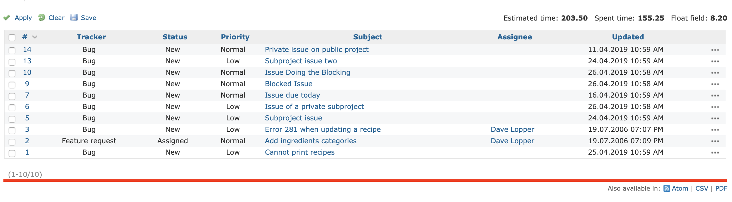
Feedback is welcomed.
Files
 Updated by Marius BĂLTEANU almost 5 years ago
- Subject changed from Move other formats links on the same line with pagination to Move "Also available in" links on the same line with pagination
") Updated by
Updated by 
Updated by Marius BĂLTEANU almost 5 years ago
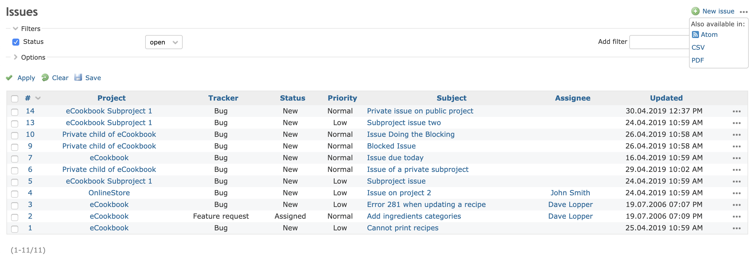
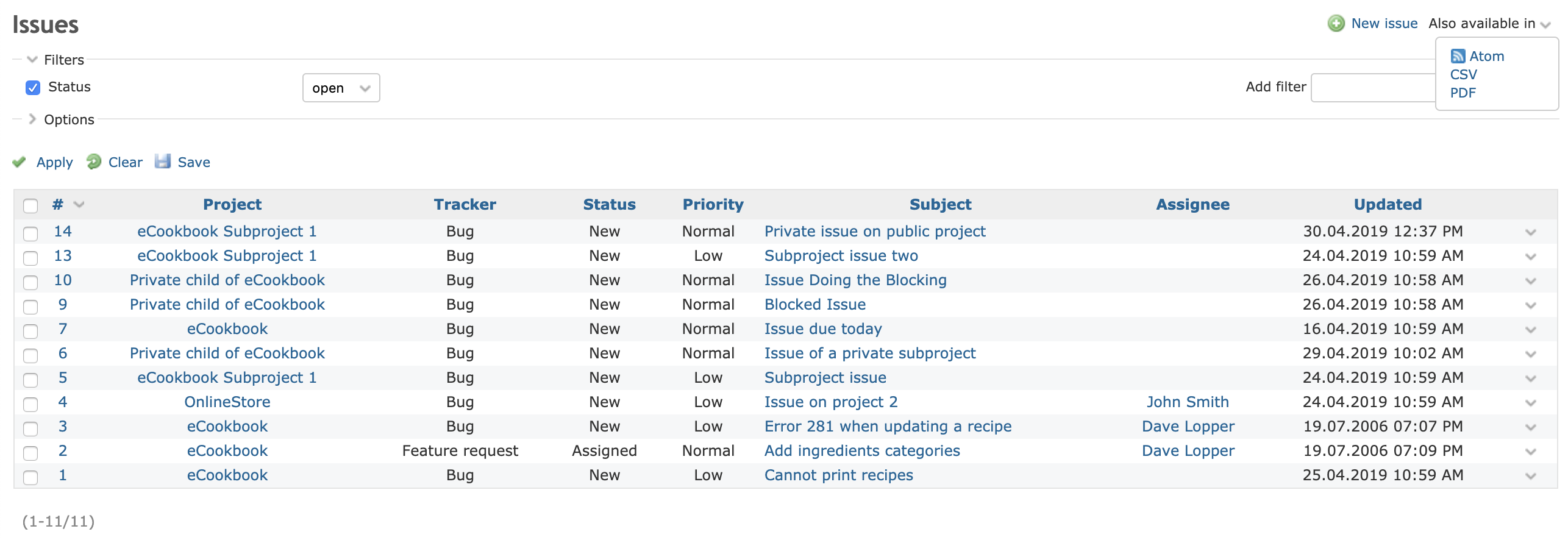
- File general_dropdown.png general_dropdown.png added
- File also_available_in_icon_dropdown.png also_available_in_icon_dropdown.png added
- File also_available_in_dropdown.png also_available_in_dropdown.png added
- Subject changed from Move "Also available in" links on the same line with pagination to Move "Also available in" links under a dropdown in the contextual area
- Description updated (diff)
Working on moving the "Also available in" link on the same line with pagination elements, I've realized that the change is not quite a real improvement and the links still:
- looks awkward on some screen sizes
- are hard to find by users when there is a lot of content on the page (ex: Projects, Activity, Issues, Wiki, etc).
I'm updating the description of this issue with some UI alternatives that move the links from the bottom of the page to the contextual area.
I'm in favour of option 3.
Updated by Marius BĂLTEANU almost 5 years ago
- Subject changed from Move "Also available in" links under a dropdown in the contextual area to Improve "Also available in" links
 Updated by Bernhard Rohloff almost 5 years ago
I like option 3 the most, too. IMHO putting them inside the contextual menu is the proper and most clean way.
Marius Ionescu what do you think. Shouldn't it also be two separate entries for subscribing the atom feed and downloading the issue/page?
Updated by Marius BĂLTEANU almost 5 years ago
Bernhard Rohloff wrote:
Marius Ionescu what do you think. Shouldn't it also be two separate entries for subscribing the atom feed and downloading the issue/page?
Are you referring to have in the contextual area two icons? one for Atom and another one with a dropdown for CSV and PDF?
Updated by Bernhard Rohloff almost 5 years ago
Marius BALTEANU wrote:
Bernhard Rohloff wrote:
Marius Ionescu what do you think. Shouldn't it also be two separate entries for subscribing the atom feed and downloading the issue/page?
Are you referring to have in the contextual area two icons? one for Atom and another one with a dropdown for CSV and PDF?
Yes, that's exactly what I meant. For me the download button is not the same as a subscription link and I would never assume to find it there.
I also think that it would help to give the icon a descriptive label so users find their choices easier.
Updated by Marius BĂLTEANU almost 5 years ago
Bernhard Rohloff wrote:
Marius BALTEANU wrote:
Bernhard Rohloff wrote:
Marius Ionescu what do you think. Shouldn't it also be two separate entries for subscribing the atom feed and downloading the issue/page?
Are you referring to have in the contextual area two icons? one for Atom and another one with a dropdown for CSV and PDF?
Yes, that's exactly what I meant. For me the download button is not the same as a subscription link and I would never assume to find it there.
I also think that it would help to give the icon a descriptive label so users find their choices easier.
Right now all three options are together, maybe a more neutral icon (like export to) with "Also available in" title is enough. I'm saying that only because I'm afraid to not add to many icons to the contextual area.
Updated by Bernhard Rohloff almost 5 years ago
Marius BALTEANU wrote:
...
Right now all three options are together, maybe a more neutral icon (like export to) with "Also available in" title is enough. I'm saying that only because I'm afraid to not add to many icons to the contextual area.
I share your concerns about bloating the contextual menu with more options but I would argue that it's way easier for the user to have labels that make crystal clear what he/she/it can do with it. If there's a button subscribe than the user knows one can subscribe to a feed. This is somewhat also the case with the current solution. My concern is that if you hide the options behind a vague description of the real purpose, some users wouldn't even discover their options.
At the moment, I can see only two really packed contextual menus. On wiki pages and the issue view. The others have only one or two items. As the count of items in this menu increase it would also make sense to hide some of them behind the currently introduced 3dot menu.