Actions
Defect #38448
closedThe margin below the Submit button on the issue edit page is too narrow
Start date:
Due date:
% Done:
0%
Estimated time:
Resolution:
Fixed
Affected version:
Description
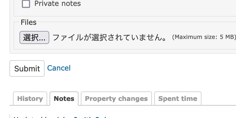
Since margin-bottom for the Submit button on the issue edit page is not set, the margin below the button is narrow when displaying the history in reverse chronological order. Therefore, the UI/UX is slightly spoiled.
The attached patch sets margin-bottom to the form area to improve the UI/UX.
Before:
After:
Files
 Updated by Go MAEDA over 1 year ago
- Target version changed from Candidate for next minor release to 4.2.11
Setting the target version to 4.2.11.
 Updated by Go MAEDA over 1 year ago
- Subject changed from The margin below the Submit button on the issue edit page is narrow to The margin below the Submit button on the issue edit page is too narrow
- Status changed from New to Resolved
- Assignee set to Go MAEDA
- Resolution set to Fixed
Committed the patch in r22192.
Actions