Actions
Defect #614
closed
Filters buttons in the issues tab should appear inside the filters fieldset
Start date:
2008-02-06
Due date:
% Done:
100%
Estimated time:
Resolution:
Affected version:
Description
The way the buttons appear now it's difficult to understand that they apply the filter settings. They look like they act over data in the table. If they appear inside the fieldset it should be more clear that they act over the filter.
Files
 Updated by
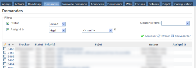
 Updated by chris mcharg over 16 years ago
I too agree that the visual associativity isn't quite right here.
While it would be fair for the filters to be in there own (visual) fieldset if there were also other input elements, here the fieldset border creates unnecessary separation between the filter inputs and the action controls.
 Updated by Jean-Philippe Lang over 16 years ago
- File filters.png filters.png added
Do you prefer something like that ?
 Updated by Iñaki Ibarrola Atxa over 16 years ago
All the team agrees that this design is easier to understand.
 Updated by Nikolay Solakov over 16 years ago
I too agree. It would be more clear design.
Nikolay
Updated by Jean-Philippe Lang over 16 years ago
- Status changed from New to Closed
- % Done changed from 0 to 100
Applied in changeset r1262.
Actions