Actions
Feature #37173
open
Better UX in sidebar
Status:
New
Priority:
Normal
Assignee:
-
Category:
UI
Target version:
-
Resolution:
Description
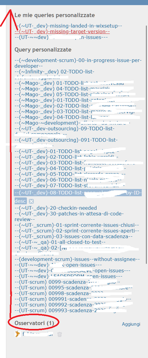
In my opinion the sidebar UX it would be better, if the watchers section were moved at the top as the first section. In fact, adding watchers is usually the most common operation among those displayed in the sidebar.
Thanks in advance.
Files
No data to display
Actions