 Issue status flow graph
Added by Brad Beattie over 17 years ago
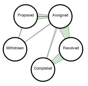
One bit of information I find difficult to track in the activity tab is how many issues have moved from one status to another in the past while. Attached is something I've been working on in the graphs plugin. Feedback?
Replies (7)
 RE: Issue status flow graph
-
Added by Markus Peter over 17 years ago
RE: Issue status flow graph
-
Added by Markus Peter over 17 years ago
I like it!
It took me a while to spot the connection back from Assigned to Proposed.
For low counts, it is difficult to see in which direction the changes occurred, and whether they occurred in both directions or not (Proposed - Withdrawn and Assigned - Withdrawn).
Does the graph get bigger/smaller depending on the number of statuses defined (to maintain distance between neighboring statuses) ?
It could be used to visualize the difference in the flow by tracker (flow of defects, flow of features, etc).
RE: Issue status flow graph
-
Added by Brad Beattie over 17 years ago
Markus Peter wrote:
For low counts, it is difficult to see in which direction the changes occurred, and whether they occurred in both directions or not (Proposed - Withdrawn and Assigned - Withdrawn).
Agreed. I tried adding arrows and it just got horribly cluttered. As a compromise, I tried colouring reverse status changes red and forward status changes green. I can make that more prominent by changing the stroke colour too. (Just tried it and it's a lot more obvious.)
Does the graph get bigger/smaller depending on the number of statuses defined (to maintain distance between neighboring statuses) ?
The statuses space themselves out around a circle, yes. Problem is when you have 10 statuses or so, things would start to overlap and look horrible. I can reduce the size of each circle, but then I have to reduce the text inside of them as well. What if someone has a very wordy status like "Superfantasticwithdrawn"? Ugh. I hate having to account for such edge cases, but you know it'll come up.
It could be used to visualize the difference in the flow by tracker (flow of defects, flow of features, etc).
Hrm. Not sure how you'd show that on top of this without it getting too busy. There's a fine balance at that point of enough information and too much data.
RE: Issue status flow graph
-
Added by Markus Peter over 17 years ago
Brad Beattie wrote:
It could be used to visualize the difference in the flow by tracker (flow of defects, flow of features, etc).
Hrm. Not sure how you'd show that on top of this without it getting too busy. There's a fine balance at that point of enough information and too much data.
I meant by having the same visualization several times, ideally side-by-side, once for every tracker. Especially since it is possible to define different workflows in redmine for every tracker. I agree that to show this in a single graph seems too much...
 RE: Issue status flow graph
-
Added by Mischa The Evil over 17 years ago
RE: Issue status flow graph
-
Added by Mischa The Evil over 17 years ago
Brad Beattie wrote:
One bit of information I find difficult to track in the activity tab is how many issues have moved from one status to another in the past while. Attached is something I've been working on in the graphs plugin. Feedback?
Hey Brad,
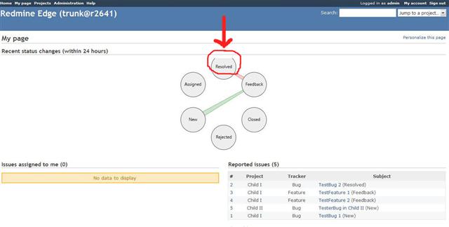
I've tested your implementation of this graph (as a my-page block) after you've pushed it to Github yesterday and noticed a small issue. The top of the graph is cut-off using the latest browser versions (Firefox 3.0.8, Opera 9.65, etc.)
Otherwise I really like the new graph... :)
I'll attach a screenshot showing the issue. HTH...
Regards,
Mischa.
| issue_status_flow_graph-cutoff_error.jpg (20.5 KB) issue_status_flow_graph-cutoff_error.jpg | Using latest plugin version (14-04-09) on Redmine trunk @ r2641 |
RE: Issue status flow graph
-
Added by Brad Beattie over 17 years ago
Mischa The Evil wrote:
Brad Beattie wrote:
One bit of information I find difficult to track in the activity tab is how many issues have moved from one status to another in the past while. Attached is something I've been working on in the graphs plugin. Feedback?
Hey Brad,
I've tested your implementation of this graph (as a my-page block) after you've pushed it to Github yesterday and noticed a small issue. The top of the graph is cut-off using the latest browser versions (Firefox 3.0.8, Opera 9.65, etc.)
Otherwise I really like the new graph... :)I'll attach a screenshot showing the issue. HTH...
Regards,
Mischa.
Mm. I kind of expected something like this to pop up. I've reverted the over-zealous truncation, but it might seem now as if to have too much padding. But yes, thanks. :)
RE: Issue status flow graph
-
Added by Mischa The Evil over 17 years ago
Brad Beattie wrote:
Mischa The Evil wrote:
[...]
Mm. I kind of expected something like this to pop up. I've reverted the over-zealous truncation, but it might seem now as if to have too much padding. But yes, thanks. :)
It seems ok to me now, though I agree that it doesn't need that much padding... :)
RE: Issue status flow graph
-
Added by Brad Beattie over 17 years ago
Mischa The Evil wrote:
Brad Beattie wrote:
Mischa The Evil wrote:
[...]
Mm. I kind of expected something like this to pop up. I've reverted the over-zealous truncation, but it might seem now as if to have too much padding. But yes, thanks. :)
It seems ok to me now, though I agree that it doesn't need that much padding... :)
By all means adjust it to the point you think it's reasonable and send me a pull request. Each time I play with it I can't seem to get it right.