Patch #20370
closedLighter colors for journal details in issue history
0%
Description
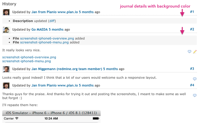
This change makes easier to distinguish details (attachments, changes of statuses, assignees, ...) and notes in a issue history.

Files
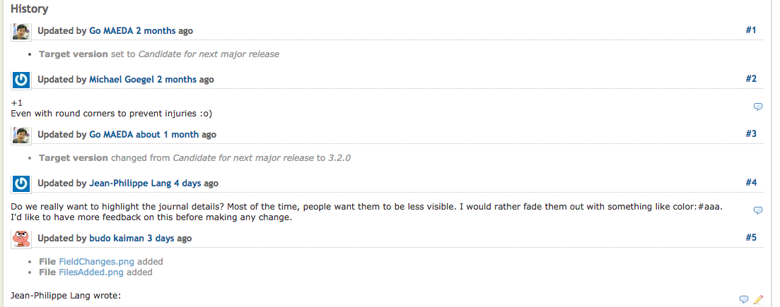
 Updated by Go MAEDA over 9 years ago
- Target version set to Candidate for next major release
 Updated by Michael Goegel over 9 years ago
+1
Even with round corners to prevent injuries :o)
 Updated by Go MAEDA about 9 years ago
- Target version changed from Candidate for next major release to 3.2.0
 Updated by Jean-Philippe Lang about 9 years ago
Do we really want to highlight the journal details? Most of the time, people want them to be less visible. I would rather fade them out with something like color:#aaa.
I'd like to have more feedback on this before making any change.
 Updated by budo kaiman about 9 years ago
- File FieldChanges.png FieldChanges.png added
- File FilesAdded.png FilesAdded.png added
Jean-Philippe Lang wrote:
Do we really want to highlight the journal details? Most of the time, people want them to be less visible. I would rather fade them out with something like color:#aaa.
I'd like to have more feedback on this before making any change.
I agree that it should be less visible opposed to highlighting it, and your suggestion looks good when only fields have changed
But when files are attached, it doesn't seem to make much difference
 Updated by Jean-Philippe Lang about 9 years ago
budo kaiman wrote:
I agree that it should be less visible opposed to highlighting it, and your suggestion looks good when only fields have changed
But when files are attached, it doesn't seem to make much difference
We can choose a lighter blue for links. For example:
.journal ul.details {color:#aaa;}
.journal ul.details a {color:#8da3cc;}
.journal ul.details a:hover {color:#c61a1a;}
 Updated by Go MAEDA about 9 years ago
Thanks for feedback. I will make an updated patch.
 Updated by Go MAEDA about 9 years ago
- File patch-20151005.diff patch-20151005.diff added
Updated the patch.
- From the viewpoint of readability, I think '#aaa' is too pale. Chose '#808080' (same color with activity description) for journal details and changed color of main text from '#484848' to '#333'.
- Increased the separation between journal details and a note.
FYI: GitHub uses '#767676' and #333'. example: https://github.com/phusion/passenger/issues/1622
 Updated by budo kaiman about 9 years ago
I agree with the decision to use '#808080' and I think the patch looks much better.

Edit: On second thought, I think '#808080' might be a tad too dark. I tried a few values and found '#959595' to work well.
 Updated by budo kaiman about 9 years ago
- File patch-20151005_lighter.diff patch-20151005_lighter.diff added
- File Redmine_patch-20151005_lighter.png Redmine_patch-20151005_lighter.png added
Attaching a patch with some lighter values which I think work better and are still readable.

 Updated by Jean-Philippe Lang about 9 years ago
- Subject changed from Set background color of journal details in a issue history to Lighter colors for journal details in issue history
- Status changed from New to Closed
- Assignee set to Jean-Philippe Lang
Patch committed in r14686, thanks.