Feature #43937
closed
Redesign the header with a navigation bar and lighter visual weight
Description
This patch updates the visual design of the default theme header to make it lighter and better balanced.
The current header feels visually heavy because the main menu is tightly coupled with the primary blue header area. This makes the header look larger than necessary and gives it a dated impression.
This patch addresses that by giving the main menu its own background color and presenting it as a bar-style navigation area, rather than leaving it visually merged with the blue header background. It also slims down the blue header area and reduces its visual weight. This makes both the header and the main menu easier to scan while keeping the familiar structure of the default theme.
Issue list: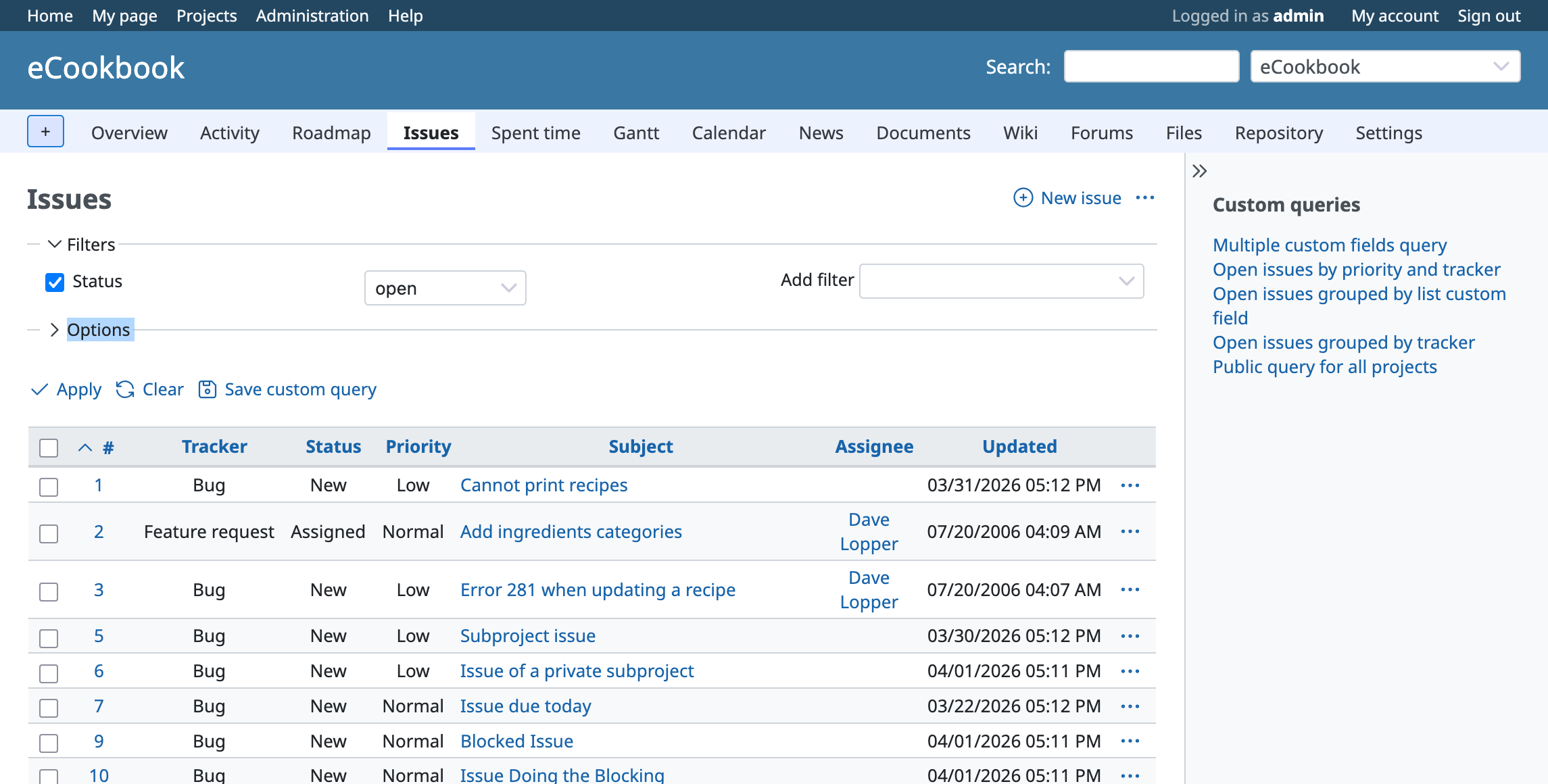
Admin page: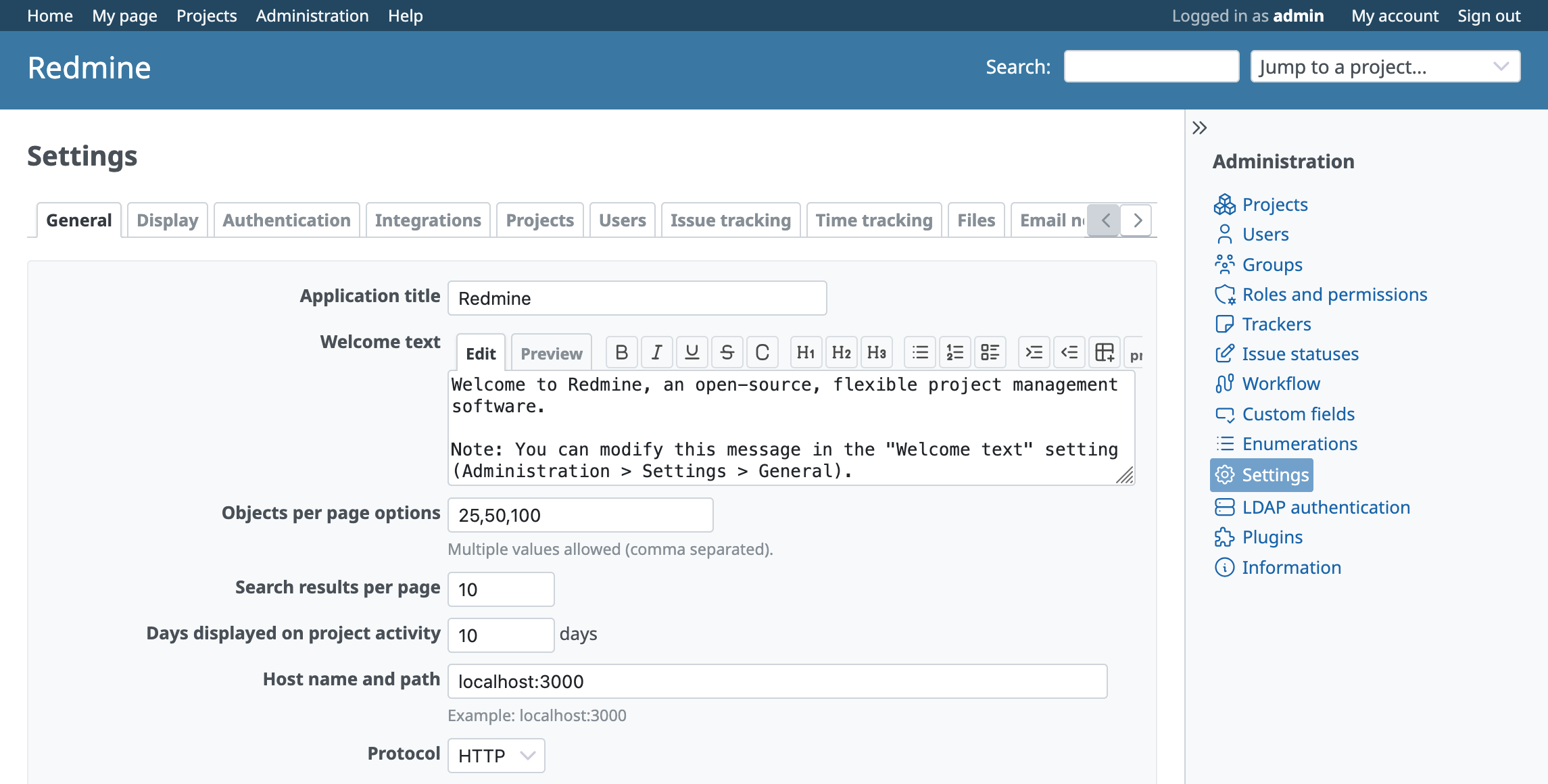
Files
 Updated by
  Updated by
 .png)
 Updated by Go MAEDA 2 months ago
Yasu Saku wrote in #note-5:
Mr. Go MAEDA
It looks like the header color on mobile is not updated. Is this expected?
Yes, it is intentional that the header color was not updated on mobile pages.
Elements such as the flyout menu background are designed to match the existing header color, so changing it would require updating related elements as well. Since that would broaden the scope of this issue, I left it unchanged.
Changing the header color on mobile pages could lead to a broader redesign of the mobile UI. I think it would be better to open a separate issue and work on it there.