Feature #14508
openWorkflow administration screen - loss of overview when working with many statuses
0%
Description
Hello,
in our project we have a lot of statuses in the workflow. This results in a big number of columns (1) in the workflow administration screen.
While this works acceptable, there is one side effect constantly leading to a loss of overview during editing. For seeing the higher columns it is required to scroll (2). This leads the vertical legend to flow out of the screen (3).
The attached screenshot hightlighths the mentioned numbers 1-3.
Would it be possible to make the vertical legend fixed, so that it is visible everytime?
Kind regards,
Matthias
Files
 Updated by Matthias Petermann over 6 years ago
This issue is addressed by a recently published plugin:
https://github.com/UweHeber/redmine-workflow-visualization-pluginIf any of the upstream Redmine developer could review this, it might be a good candidate for inclusion in the official tree.
 Updated by Mizuki ISHIKAWA over 3 years ago
- File status-tansistions.gif status-tansistions.gif added
- File fields_permissions.gif fields_permissions.gif added
- File feature-14508.patch feature-14508.patch added
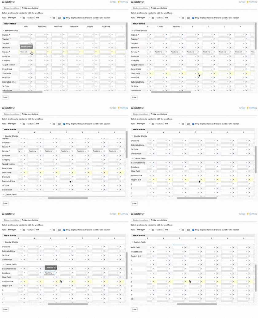
By applying the attached patch, the header of the large table in the workflow is fixed and easy to see.
It is a simple change that uses a CSS property position: sticky and does not require JavaScript.
It works fine with Chrome, Firefox, Safari and Edge.
In IE11, the header is not fixed because position: sticky; cannot be used, but it will be displayed in almost the same way as before the change.
 |
 |
 Updated by Go MAEDA over 3 years ago
- Target version set to Candidate for next major release