Defect #26403
closedThe second and subsequent lines of commit messages are not displayed in repository browser
Description
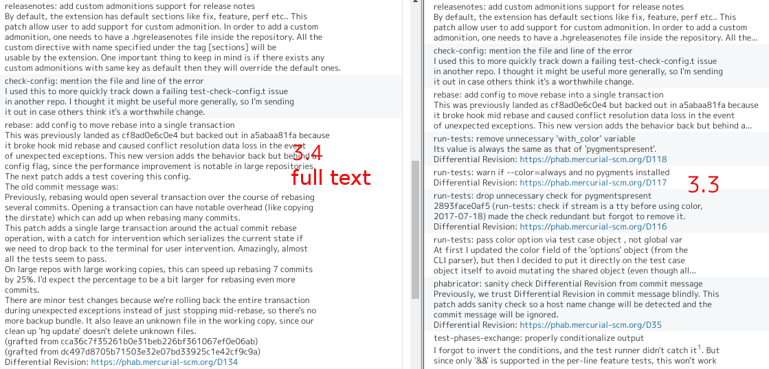
After r16062, only the first line of a commit message is displayed in revisions list of the repository browser.
In my opinion, repository browser should not truncate commit messages because it often contain important information for developers.
I hope that this change will be undone in 3.4.2.
Redmine 3.3:
Redmine 3.4:
Files
 Updated by Toshi MARUYAMA almost 9 years ago
But your patch shows all text.
Redmine 3.3 truncates to 255 chars.
source:tags/3.3.4/app/helpers/repositories_helper.rb#L29
 Updated by Yuichi Ishii almost 9 years ago
This problem stops my team from updating to 3.4.0.
I hope this will be fixed as soon as possible.
 Updated by Jean-Philippe Lang almost 9 years ago
Yuichi Ishii wrote:
This problem stops my team from updating to 3.4.0.
I hope this will be fixed as soon as possible.
Do you really need to see more than the first line of the message in the revision list? The full commit message is still visible on the commit details view.
 Updated by Yuichi Ishii almost 9 years ago
Do you really need to see more than the first line of the message in the revision list? The full commit message is still visible on the commit details view.
Thanks for the reply. Yes, we really do.
Most of our commit messages contain more than one line, and reviewers use the repository browser in order to see recent commits roughly.
 Updated by Yuuki NARA almost 9 years ago
+1
I agree with the need for multi line display of the repository browser.
(It is also possible with option setting)
Traceability for tickets and changing source code is necessary for maintenance efficiency.
In order to investigate the outline of source code change details later .
It is necessary to use multiple line and new line , to make it easy to see.
If you force it into one line, it becomes difficult to grasp the contents
 Updated by Jean-Philippe Lang almost 9 years ago
Should we truncate at 255 characters (which was the behaviour in all prior versions) or display the full commit message in the revision list?
 Updated by Toshi MARUYAMA almost 9 years ago
I think truncating at some characters is better because full text is very annoying.
https://www.mercurial-scm.org/repo/hg/shortlog/4.3-rc

 Updated by Jean-Philippe Lang almost 9 years ago
What about displaying the first line with a toggle button that would show the full commit message?
 Updated by Yuichi Ishii almost 9 years ago
What about displaying the first line with a toggle button that would show the full commit message?
Thank you for this nice idea. But the 3.3 or older versions style is better for us.
Because it helps us see outlines of commit messages easily.
 Updated by Jean-Philippe Lang almost 9 years ago
- Status changed from New to Resolved
- Assignee set to Jean-Philippe Lang
- Resolution set to Fixed
r16843 restores the same behaviour as 3.3 for displaying commit messages in the revision list.
 Updated by Jean-Philippe Lang over 8 years ago
- Status changed from Resolved to Closed