Patch #29951
closed
Quick design fix/proposals for projects index page
0%
Description
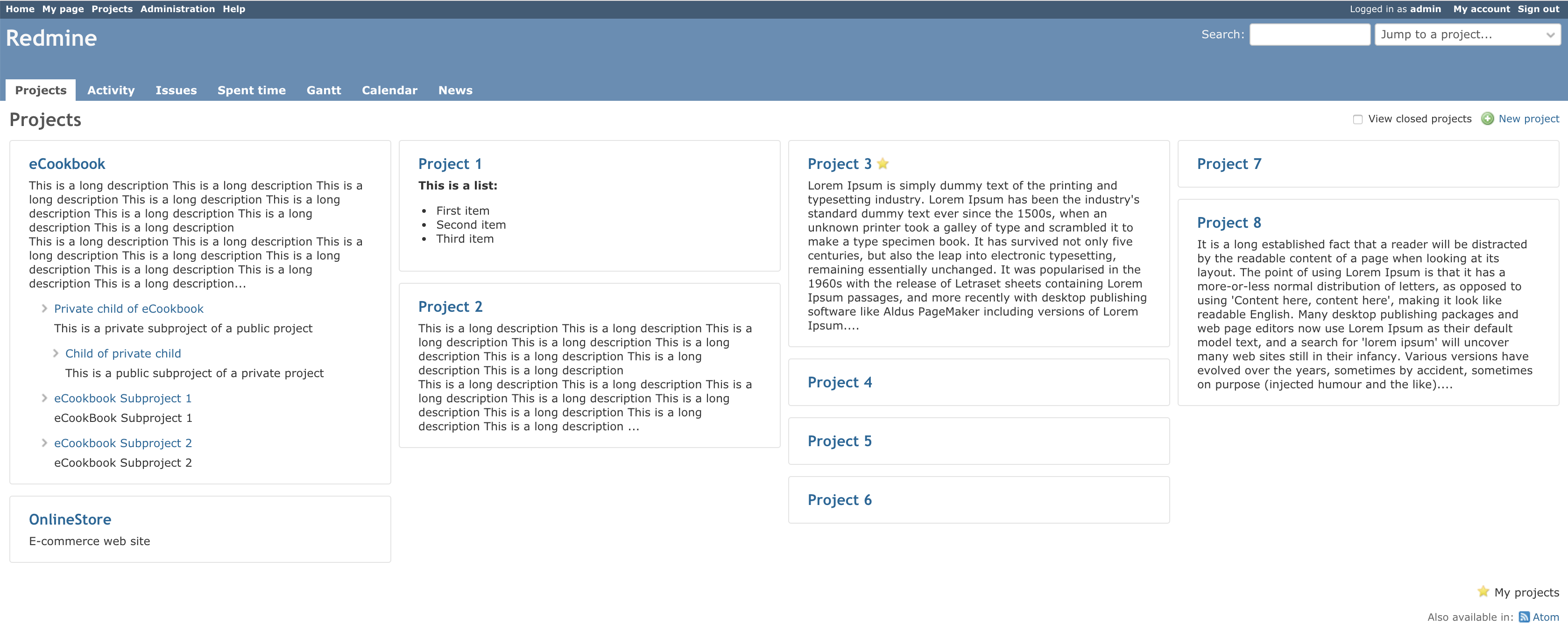
I'm attaching two proposals for the projects index page that can be achieved only with some CSS changes.
The single difference between the two proposals is how the subprojects are displayed.
1. Using the current method with left border, but applied for all subprojects, not only for the first children.
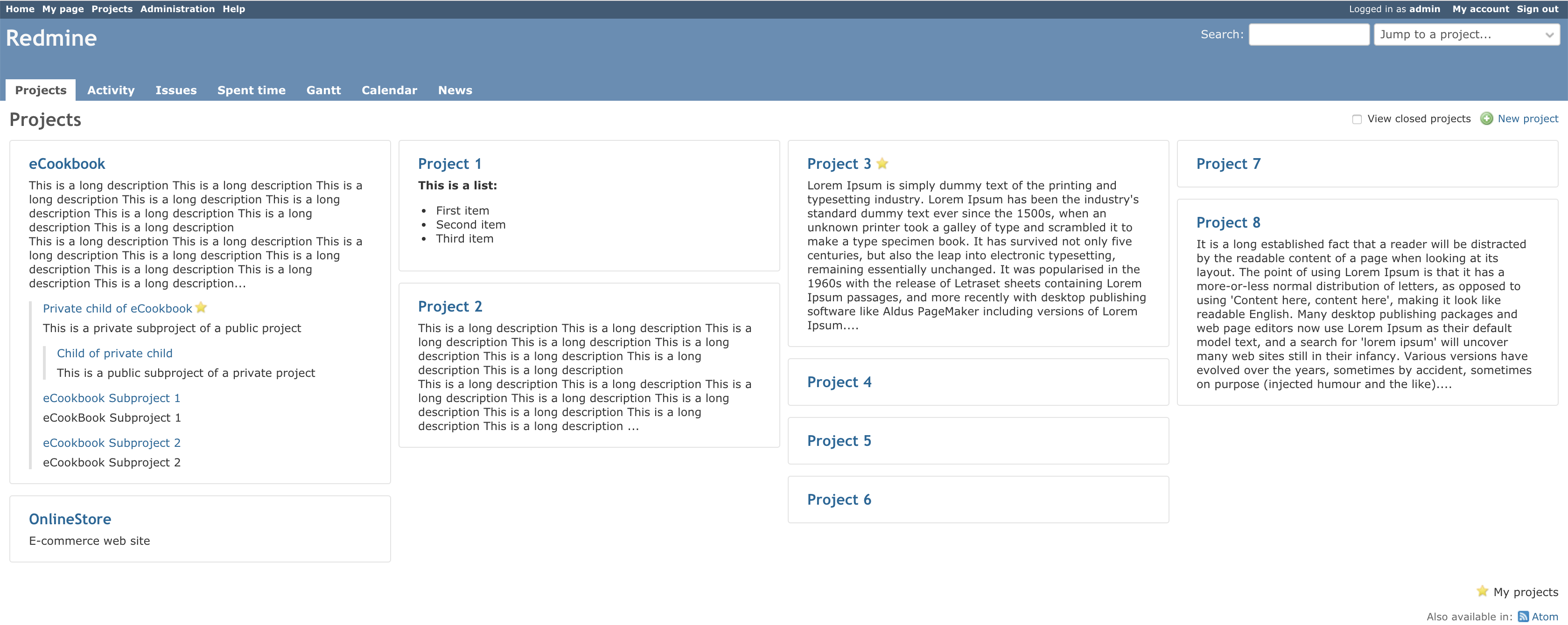
2. Replaced the left border with the existing arrow used in other pages to display subprojects or subtasks.
![]()
As I said also in the #26853, the current implementation is considered by many users a defect (7 issue reported since then) and is one of the most reported issue lately.

Any feedback is welcome. I'll add the patch for review/testing very soon.
Files
Related issues
 Updated by Marius BĂLTEANU almost 6 years ago
- Related to Defect #26853: Fix hardcoded project-index width for webkit and mozilla browsers added
Updated by Marius BĂLTEANU almost 6 years ago
- Related to Feature #29482: Query system for Projects page added
 Updated by Bernhard Rohloff almost 6 years ago
First of all I really like the idea of different views to navigate through projects in Redmine. I think that it can be very beneficial if you offer the user different viewing angles to fit their specific needs.
I find this particular design quite difficult as it mixes up two very different concepts of presentation. Tiles and trees. I think that it is not unusual behavior that people create logical, very nested structures like with folders on a file system. There are projects which represent different departments, customers, collections of projects, portfolios etc... I see a problems if many projects are collected under a single parent project which I think is very common. So if you have one or two projects which contain a few tens of projects, the view gets very ugly because you have most of your projects stuffed to the top of the page and single projects seem to drip to the bottom like wet paint.
What i would prefer the most is a tile based view of just one layer at a time where you can click through the subprojects like through folders in a file manager. It's a presentation I'm used to and it's easy for me to navigate. This in combination with a search bar would be the only view I ever need.
PS: If only these two options would be available I would tend to the version with arrows but just because it looks prettier to me. And everything is better than the existing one!
 Updated by Sergey Trofimov almost 6 years ago
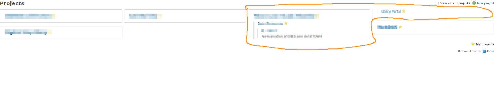
I like the proposal of Marius BALTEANU (so I don't want to create another issue). The projects page sometimes looks ugly. In my case the project is displayed in one column but it's subproject - in other column (see attached screenshot).

Updated by Marius BĂLTEANU almost 6 years ago
- File 0001-Do-not-break-inside-columns.patch added
- File safari.png safari.png added
- Subject changed from Design proposals for projects index page to Quick design fix/proposals for projects index page
We can achieve a better projects page only with some CSS changes. The most important change is to not allow to break inside a column.
The proposed solution has a down side effect on Safari (which is a known issue and I didn't find any solution to it).

Updated by Marius BĂLTEANU almost 6 years ago
- File deleted (
0001-Do-not-break-inside-columns.patch)
Updated by Marius BĂLTEANU almost 6 years ago
 Updated by Kim Henriksen almost 6 years ago
- File projects-overview.png projects-overview.png added
Tried to apply the patch, but doesn't seems to make sub-sub projects not break:
Updated by Marius BĂLTEANU almost 6 years ago
Kim Henriksen wrote:
Tried to apply the patch, but doesn't seems to make sub-sub projects not break:
Did you restart your webserver or hard reset your cache?
Updated by Marius BĂLTEANU almost 6 years ago
Bernhard Rohloff wrote:
First of all I really like the idea of different views to navigate through projects in Redmine. I think that it can be very beneficial if you offer the user different viewing angles to fit their specific needs.
I find this particular design quite difficult as it mixes up two very different concepts of presentation. Tiles and trees. I think that it is not unusual behavior that people create logical, very nested structures like with folders on a file system. There are projects which represent different departments, customers, collections of projects, portfolios etc... I see a problems if many projects are collected under a single parent project which I think is very common. So if you have one or two projects which contain a few tens of projects, the view gets very ugly because you have most of your projects stuffed to the top of the page and single projects seem to drip to the bottom like wet paint.
Yes, you're right, there are cases when the view will be quite ugly, but I tried to find a better solution than the actual view until we discuss the implementation of #29482 (which will allow us to switch between two views: table list and a multi column list).
What i would prefer the most is a tile based view of just one layer at a time where you can click through the subprojects like through folders in a file manager. It's a presentation I'm used to and it's easy for me to navigate. This in combination with a search bar would be the only view I ever need.
Bernhard, nice idea, but it requires more changes.
Updated by Bernhard Rohloff almost 6 years ago
Marius BALTEANU wrote:
Bernhard, nice idea, but it requires more changes.
Until we are getting there I'm totally fine with this solution as it's a thousand times better then the existing one.
Updated by Marius BĂLTEANU almost 6 years ago
- Assignee set to Jean-Philippe Lang
- Target version set to 3.4.8
I'm assigning this to 3.4.8 because I think that we should do something with the current projects page which is reported as defect by too many users (see #26853 and the related issues).
Jean-Philippe, until we implement #29482, I think the proposed patch improves the current projects page. If you don't like the border around each root project, I think that at least the "break-inside: avoid-column;" rules are enough. What do you think?
 Updated by Jean-Philippe Lang almost 6 years ago
- Category set to UI
- Status changed from New to Closed
Patch committed, thanks.
Updated by Marius BĂLTEANU almost 6 years ago
- Has duplicate Defect #28708: Project display should have text belonging to project in same column added
Updated by Marius BĂLTEANU almost 6 years ago
- Related to Defect #30510: Bad Project's page Form added