Patch #16240
closed
Private notes should be marked more clearly
Description
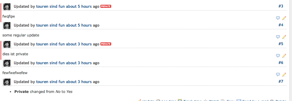
Here's a screenshot and a patch. It makes it more consistent with privat issues.
Files
 Updated by Jan from Planio www.plan.io over 12 years ago
- Description updated (diff)
 Updated by Toshi MARUYAMA about 12 years ago
- Target version changed from Candidate for next minor release to 2.6.0
 Updated by Jean-Baptiste Barth almost 12 years ago
- Assignee set to Jean-Baptiste Barth
I like the idea, and I'm afraid nobody else is looking at this for now.
That's the major point that keeps me with my absurd "redmine_comments" plugin on my redmine instances. I took the approach even further with a completely different style for private notes (= internal comments for staff in my case ; but there may be other use cases?). I guess it's too opinionated but let me know what you think: https://github.com/jbbarth/redmine_comments#screenshot
In any case I think the actual integration has to be improved, so I take the issue. Depending on your feedback I'll commit your change as is, it looks good to me.
Updated by Jan from Planio www.plan.io almost 12 years ago
I took the approach even further with a completely different style for private notes (= internal comments for staff in my case ; but there may be other use cases?). I guess it's too opinionated but let me know what you think: https://github.com/jbbarth/redmine_comments#screenshot
I didn't try the plugin, just had a look at the screenshot. As you might have noticed in my previous comments, I am a big fan of consistency, especially when it comes to UI concepts. Therefore, I wanted to add the red PRIVATE label: because it is used on private issues also and will be recognized by users easily (as opposed to the vertical red line by itself; I think it can easily be overlooked; or people could notice it but would not know what it means).
Your screenshot in itself looks consistent to me and I like it. However, I am not sure how it relates to the Redmine core themes? The regular journal has a yellow background and a 1px silver border. That's not the default Redmine theme, is it? Do you have a demo Redmine where one can try out the plugin?
Updated by Jean-Baptiste Barth almost 12 years ago
- Status changed from Needs feedback to Closed
Actually I don't suggest we switch to "my" design directly, I was just wondering if we should push the design change further. Anyway you're right I'm already on a theme slightly different from the default ones.
The first step you propose is already nice. I committed it in r13367.
One note about this: the locale key is the one used for private issues, while private notes are marked with l(:field_private_notes), but the key is pluralized, so it was a bit weird to have a pluralized expression beside each individual note. Hence I left your patch exactly as is...
Thanks!