Actions
Defect #42786
closed
"Clear" button for custom queries has incorrect styling inside the flyout menu
Resolution:
Fixed
Affected version:
Description
There are currently several issues with the display of custom queries inside the flyout menu (shown on narrow screens):
- The "Clear" button appears on a separate line.
- The "Clear" button is blue and hard to see.
- The button is visually misaligned compared to surrounding elements.
Screenshot: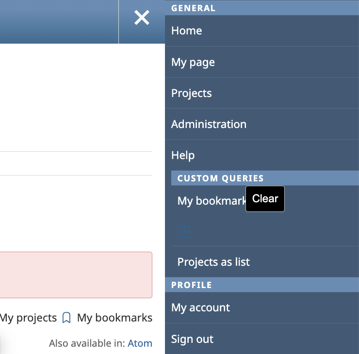
- Applies the same flex layout to .queries li as used for .watchers li, fixing the line break issue of the "Clear" button.
- Ensures consistent borders after applying flex, by manually restoring border behavior where needed.
- Sets stroke: white for icons to improve visibility against the dark background.
- Adjusts the overall horizontal offset of the #sidebar-wrapper using margin-left: -8px to fix the right shift.
Files
 Updated by Go MAEDA about 1 year ago
- Subject changed from The style of the "Clear" button breaks inside the flyout menu. to The style of the "Clear" button breaks inside the flyout menu
- Status changed from New to Confirmed
- Target version set to 6.0.6
Setting the target version to 6.0.6.
Updated by Go MAEDA about 1 year ago
- Subject changed from The style of the "Clear" button breaks inside the flyout menu to "Clear" button for custom queries has incorrect styling inside the flyout menu
- Status changed from Confirmed to Resolved
- Assignee set to Go MAEDA
- Resolution set to Fixed
Committed the patch in r23816. Thank you.
Updated by Go MAEDA about 1 year ago
- Status changed from Resolved to Closed
Merged the fix into 6.0-stalbe branch in r23818.
Actions