 Redmine Logo?
Added by Jim Mulholland almost 16 years ago
Our team was going to create a Redmine Mac OS X Fluid webapp. However, we were not sure what the logo should be to symbolize Redmine on our Mac dock.
Does Redmine have an official logo?
Replies (119)
 RE: Redmine Logo?
-
Added by Thomas Lecavelier almost 16 years ago
RE: Redmine Logo?
-
Added by Thomas Lecavelier almost 16 years ago
I don't think so. I remember something like a mine with a pic-axe and an halo around the mine entrance, but I can't find it again.
 RE: Redmine Logo?
-
Added by Daniel Farrell almost 16 years ago
RE: Redmine Logo?
-
Added by Daniel Farrell almost 16 years ago
I was just searching for a redmine logo for the same exact reason. If you guys have come up with something good would you mind sharing it?
 RE: Redmine Logo?
-
Added by Maxim Krušina almost 16 years ago
RE: Redmine Logo?
-
Added by Maxim Krušina almost 16 years ago
Hi there! I already discuss logotype creating with Jean-Philippe...
We have some ideas about Redmine logotype and product identity, however we have been deep in finishing some big projects. Anyway, thanx to Redmine, projects are already done, so we can prepare some preview drawings... please, can you hold on for one or two weeks? We need to cook our ideas into results ;)
 RE: RE: Redmine Logo?
-
Added by Sergej Jegorov almost 16 years ago
RE: RE: Redmine Logo?
-
Added by Sergej Jegorov almost 16 years ago
![]()
| Redmine_logo_sergio_670x137.png (74 KB) Redmine_logo_sergio_670x137.png | Redmine logo ;) | ||
| Redmine_logo_sergio.svg (111 KB) Redmine_logo_sergio.svg | Sources |
RE: Redmine Logo?
-
Added by Maxim Krušina almost 16 years ago
Sorry for not beeing polite, but NO, PLEASE NO!
RE: Redmine Logo?
-
Added by Sergej Jegorov almost 16 years ago
Sorry
you can delete my previous post.
 RE: Redmine Logo?
-
Added by Steve Woodrow almost 16 years ago
RE: Redmine Logo?
-
Added by Steve Woodrow almost 16 years ago
Could Jean-Philippe or someone else involved in the project please explain the etymology/origins of the "Redmine" project name? I would be interested in contributing a logo, but it would be helpful to understand where the name came from (I presume it's a play on the fact that the project is written in Ruby).
Thanks!
 RE: Redmine Logo?
-
Added by Jean-Philippe Lang almost 16 years ago
RE: Redmine Logo?
-
Added by Jean-Philippe Lang almost 16 years ago
I presume it's a play on the fact that the project is written in Ruby
Indeed, it's the best answer I can give :-)
I have no particular idea for a logo, so any proposition is welcome even it doesn't represent a red mine.
 RE: Redmine Logo?
-
Added by Jean-François Boutier almost 16 years ago
RE: Redmine Logo?
-
Added by Jean-François Boutier almost 16 years ago
Salut Jean-Philippe,
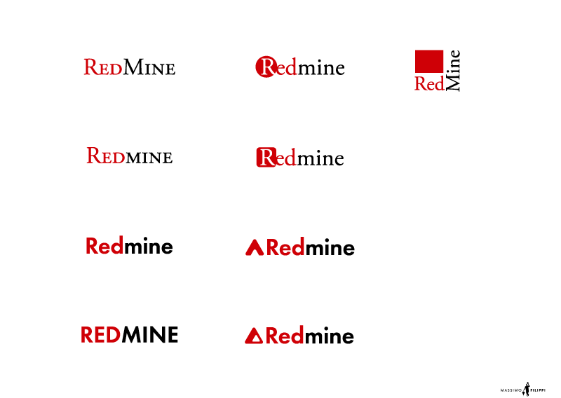
I've made a logo with Inkscape.
I post it here in .png because the .svg doesn't render as expected.
It's a first try, I've got other ideas that have to be sketched.
If you have suggestions about this one let me know...
| redmine1.png (66.2 KB) redmine1.png | Essai logo Redmine |
RE: Redmine Logo?
-
Added by Steve Woodrow almost 16 years ago
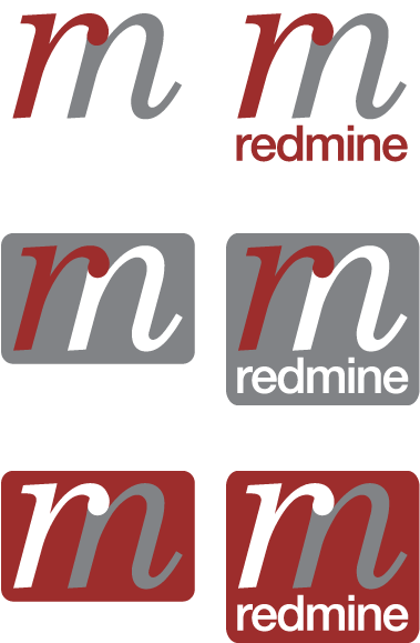
I've also drawn something up — a "wordmark" to start with. I still think something playing on the mining theme could be fun, but this was the first idea that I've had a chance to implement.
Suggestions/critique/etc. is of course welcome.
| redmine_wordmark_sample_srw.png (28.2 KB) redmine_wordmark_sample_srw.png | Redmine wordmark - 3 colors |
 RE: RE: Redmine Logo?
-
Added by Brian Terlson almost 16 years ago
RE: RE: Redmine Logo?
-
Added by Brian Terlson almost 16 years ago
I quite like that last one. Only downside as I see it is that the logo itself first read as "rn" instead of r and m combined. Aesthetically, though, it's pretty solid.


RE: Redmine Logo?
-
Added by Maxim Krušina almost 16 years ago
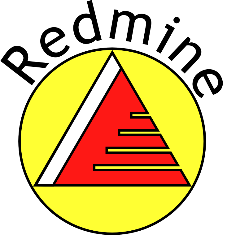
Hi guys, so there is some preview what is happening in my head.
I think that colors are OK - Red and Black. Red is obvious, it's taken from name of app, black is good complimentary color. It's deep, it looks great with red, it's simple to print and it gives depth to logotype, because there are two bright extremes: white paper and black text, so it wirks great.
Also I tried to play a bit with typefaces, I think that both serif and sans-serif versions are ok...
The last - shape of logo - I have some ideas, but I still feel it's not exactly what I want...
IMHO good logotype is composed of great typeface and absolutely unique logo, or graphical symbol... and this symbol has to be definitely tuned. It can do something with mone.... redmine... mit in must be unique, so if you will see symbol alone, without text, the first in your mind must be "uh, yeah, it's redmine !". Good examples are logotypes of car manufacturers.
I will play a bit more this weekend on our cottage ;)
Here is PDF preview: http://www.massimo-filippi.cz/showroom/redmine/
![]()
| MF-Redmine-logo-02.png (18.9 KB) MF-Redmine-logo-02.png |
RE: Redmine Logo?
-
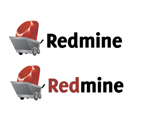
Added by Jim Mulholland almost 16 years ago
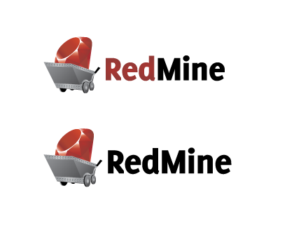
Hey guys, I think we are getting close on a good logo design. This has been a very good community exercise.
We agree with Maxim in that a good logo should be a good graphical representation of the application that makes people think Redmine immediately when they see it. Just like you immediate think "Trac" when you see that big paw print. Even though JP said that it did not have to actually be a "red mine", we thought that something in this direction made the most sense. Since Redmine is built on Ruby and rubies are red, we always envisioned a ruby mine when talking about the application.
With that being said, here is the logo that we came up with.
Thoughts?
| redmine_cart.png (21 KB) redmine_cart.png | Redmine Cart |
 RE: Redmine Logo?
-
Added by Wynn Netherland almost 16 years ago
RE: Redmine Logo?
-
Added by Wynn Netherland almost 16 years ago
Sorry, I didn't notice that it was Redmine wasn't camel-cased. I'm uploading the correction along with the Fluid icon and AI if someone cares to use it.
Thanks,
-- Wynn
| redmine_cart.png (31.1 KB) redmine_cart.png | |||
| redmine_fluid.png (58.8 KB) redmine_fluid.png | Cart Only |
RE: Redmine Logo?
-
Added by Wynn Netherland almost 16 years ago
Not sure what happened to the zip file on the previous post, trying this again...
 RE: Redmine Logo?
-
Added by Kit Plummer almost 16 years ago
RE: Redmine Logo?
-
Added by Kit Plummer almost 16 years ago
I like Maxim' bottom-right rendition. I like the triangle. I'm not liking the "cart" so much...
Kit
 RE: RE: Redmine Logo?
-
Added by Carl Nygard almost 16 years ago
RE: RE: Redmine Logo?
-
Added by Carl Nygard almost 16 years ago
I like the triangle as well. However, the real mine icon from USGS looks a bit like (pardon my ascii graphics):
+------+
|+++++ |
|+++   |
|+     |
+------+
I.e. a half filled square.
PS. Hate the wagon.
PPS. Steve's stuff is interesting as well. Perhaps it can be resized into the mine map icon shape?
RE: RE: RE: Redmine Logo?
-
Added by Daniel Farrell almost 16 years ago
Lots of good stuff here. I liked steve's a lot and made these icons for a favicon and icon to use for fluid. Might make someone's life a little easier.
| favicon.ico (4.19 KB) favicon.ico | |||
| redmine_icon.png (6.95 KB) redmine_icon.png |
 RE: Redmine Logo?
-
Added by Anonymous almost 16 years ago
RE: Redmine Logo?
-
Added by Anonymous almost 16 years ago
Two more (rough) suggestions:
- Redmine is a project management tool.
- The broken version should symbolize that a project consists of many parts (fragments).
- I like the second version because it looks quite iconographic and you could say, there is the project in the left upper corner and redmine/people/resources embraces it and take care.
- The logo - of course - has been derived from the normal ruby logo. People will know, it is a ruby/rails app at once.
- Logotype
- As Maxim I like the red/black combination, my logo is red, hence the type is black
- Redmine is cool and a joy to use. I tried to propagate this feeling by distorting the typeface (taken from Maxim). Instead of distorting we could maybe also use one of the nice (FontFont etc.) typefaces.
- The lower and higher lines from 'R' and 'd' give a nice symmetry.
- I considered the i-point as disturbing and left it out. There is such a character and Redmine could be written (e.g. in a brochure) as "Redmıne"
- Maybe both suggestions are too normal. The ruby is already used at many places. And the whole thing may also have a little resemblance with the trac logo (which may be a good/bad thing?).
- I love the 'chariot' with a ruby as an icon, but I don't think, it would represent Redmine well. This is not about mining ruby gemstones but about project management
- Concerning Redmine where the Red-part is, well, red, and the mine-part black:
- In my opinion this is too obvious (and also a bit dated)
- Furthermore the red Red-Brand is used elsewhere
- I'd prefer to stick to one color for the logotype
- I like the rm logos from Steve. However I am not sure if they work (how would they look like as a small logo? would people recognize 'r' and 'm' and link it to redmine?).
- From Maxims versions I like the two lower icons on the right best.
Please consider this only as a very provisional. I am not a graphic designer and not able (unfortunately) to make it into a polished logo/logotype.
Have a nice weekend,
Hans-Peter
RE: Redmine Logo?
-
Added by Anonymous almost 16 years ago
PS: if someone can modify my forum post to inline the images, please do... Thanks!
RE: Redmine Logo?
-
Added by Jim Mulholland almost 16 years ago
Hans-Peter, I inlined your logos for you on your first post.
My feedback:- Hans-Peter: I give you credit for going a different direction and thinking things through. However, as you mentioned, this is very rough. I think you would need to find somebody that has the same vision and clean it up quite a bit in order for the community to get your idea.
- Maxim: Very clean but no real logo to go with. I don't think the "R" by a circle or triangle or the square box or the open triangle are enough for a brand. I am looking forward to see what you come up with at the cottage this weekend, though!
- Steve: Very nice design and that could easily become an icon or logo. However, it still just screams "RN" to me which makes me think of nurses and doctors' offices. It also has more of an "enterprisey" feel which is probably neither here nor there.
- Jean-François - I honestly have no idea what that is supposed to be
- Wynn / Jim (me) - I'm obviously partial to this since Wynn and I came up with the idea. ;-) It could use a little tweaking, but I like the in your face concept of a mine-car and a ruby. I also think the logo looks very professional even as a rough draft.
With all of that being said, it is excellent that the community has been so active with this and we have options. Hopefully, we can get a few more entries and/or more feedback on current entries to help the community come to a consensus on a choice, but JP will have to have the final word since this is his baby.
Maybe somebody could whip up a quick Redmine polling plugin to help with the decision! ;-)
RE: Redmine Logo?
-
Added by Jean-François Boutier almost 16 years ago
I post some other suggestions.
Concerning my first one, you can forget it as your following work is as far as better designed.
I do something in the style of Maxim.

| Redmine-global.png (38 KB) Redmine-global.png |