Patch #22278
closedRevision Graph and Table should work with vertical-align: middle
Description
The revision list and the Raphael based graph next to it, are currently assumed to be vertical-align: top, i.e. the dots representing the commits are always positioned at the top of the table cell. This is a limitation for theme authors. Planio e.g. restyled the table to use vertical-align: middle but now the dots are misplaced.
The patch attached inspects the currently used css properties to properly calculate the dot's position. The patch is targeted at current trunk r15251.
Files
 Updated by Go MAEDA about 10 years ago
- Category changed from Themes to UI
Thanks for the patch. Could you show screenshots of the effect of this patch?
 Updated by Gregor Schmidt about 10 years ago
- File theme-without-patch.png theme-without-patch.png added
- File theme-with-patch.png theme-with-patch.png added
- File default-with-patch.png default-with-patch.png added
- File planio-with-patch.png planio-with-patch.png added
Sure, here we go!
For "educational purpose" I've created a simple theme with the following application.css
@import url(../../../stylesheets/application.css);

table.changesets td {
  vertical-align: middle;
}
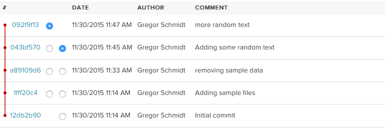
Using this theme and the current Redmine trunk, I get the following revision table

Using the patch, I get the following

while the default theme still looks as expected

This example theme does not make a lot of sense on its own. It was just created for testing. But e.g. Planio's new design uses vertical-align: middle for its tables. (Planio already has the patch applied.)

 Updated by Go MAEDA about 10 years ago
- Target version set to 3.2.2
Thanks, I understand.
Setting target version to 3.2.2.
 Updated by Jean-Philippe Lang about 10 years ago
- Status changed from New to Closed
- Assignee set to Jean-Philippe Lang
Committed, thanks.