 FEEDBACK WANTED - Modernize Redmine's top menu.
Added by Bernhard Rohloff almost 5 years ago
Hi Redmine community,
lately I had some time to play around with Redmine's user interface. It would be great to get some feedback from the community if this is a thing worth to push forward.
I tried to clean up the top section of Redmine to make it more usable and structured.
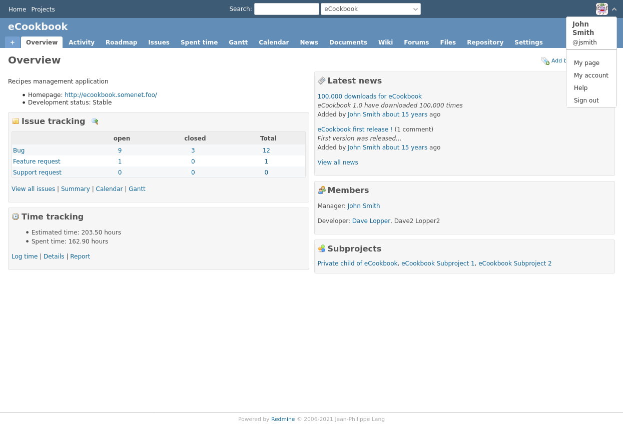
The top bar is devided in three divisions. The left side is for global navigation, the middle part is for search and switching projects and the right side is meant user centric menus and actions.
The searchbar and the project-jump dropdown menu are placed in the center to make them more discoverable and accessible.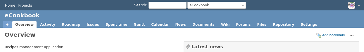
All user specific links are collected in a dropdown menu to keep the user interface clean. This gains space for user centric elements (notifications, time tracker, etc.) which could be integrated in the future.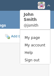
So how do you like these ideas? Shall we evolve on that and integrate this concept into Redmine's core? I'm looking forward for your feedback. :-)
Replies (2)
 RE: FEEDBACK WANTED - Modernize Redmine's top menu.
-
Added by Mischa The Evil almost 5 years ago
RE: FEEDBACK WANTED - Modernize Redmine's top menu.
-
Added by Mischa The Evil almost 5 years ago
- It's just a matter of taste but I don't like the centered items in the top menu;
- Oh, and I think that the help menu item is not per se user-centric;
- I presume you placed the 'Administration' item on the left side;
- I actually do like the wrapped-up account menu very much.
RE: FEEDBACK WANTED - Modernize Redmine's top menu.
-
Added by Bernhard Rohloff almost 5 years ago
Thank you very much for your feedback Mischa, I highly appreciate it.
Mischa The Evil wrote:
Just my two cents on this proposal:
- It's just a matter of taste but I don't like the centered items in the top menu;
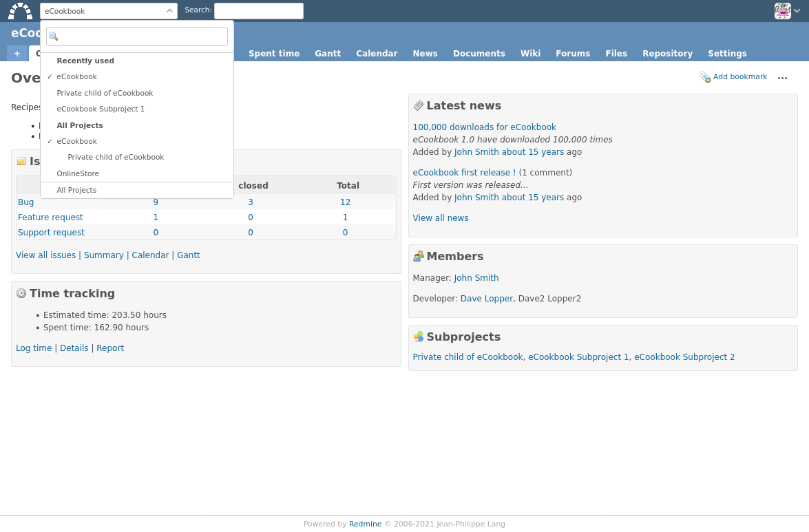
Fair enough. Here's another layout which I think could be more appealing. I'm excited to get your feedback on this one.
I've completely removed the navigation menu and added a logo which is a link to the home screen.
- Oh, and I think that the help menu item is not per se user-centric;
You're right, but I think it's the place most people would look for it. Other applications/services like Nextcloud or GitHub have placed it there, too.
- I presume you placed the 'Administration' item on the left side;
Good point. I actually placed it in the user menu to keep the navigation clean. I don't know if it's the right place for it, to be honest.
- I actually do like the wrapped-up account menu very much.
Me, too. :-) I'll clean it up and submit a patch to #31353 in the next couple of weeks.
| Redmine_top_menu_2.png (90.7 KB) Redmine_top_menu_2.png |