Feature #43207
open
Refine main menu by changing from tab style to indicator style
Description
The attached patch changes the main menu from the traditional tab style to an indicator style.
The current tab-based design feels somewhat outdated, and the goal of this change is to simplify the main menu and give it a more modern appearance.
- The indicator color was set to light blue, which harmonizes with the header and gives a calm impression
- To improve the visibility of the active menu, the indicator was made slightly thicker (5px) and the text was set in bold
- The indicator color on hover inherits the hover color from the current tab design
- To make hovered tabs more noticeable, a subtle white text-shadow was added to create a faint glowing effect
- To further improve the visibility of the indicator, a text-shadow in the same color as the header was added to the header
Current design: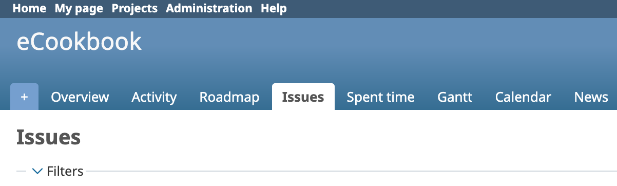
New design: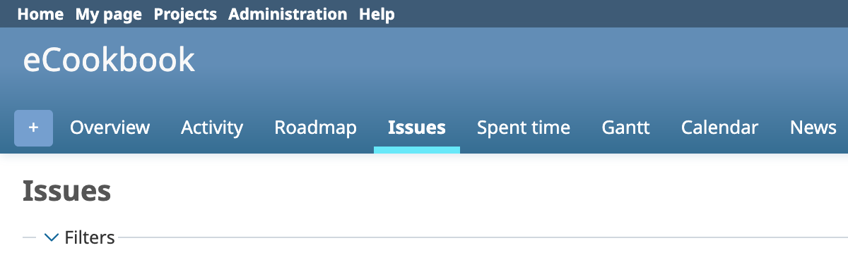
Files
 Updated by Holger Just 10 months ago
Thank you for working on this. The advantage of the current tab style is that is is visually very clear which tab is selected due to the inverted background of the tab.
With just the colored underline, I have a harder time to detect the currently selected tab with a quick glance. While this style may look "more modern", I personally see it as a step back from a usability perspective, unfortunately.
The "contrast" between the active tab and the inactive tabs could possible be increase by "dimming" the non-active tabs, e.g. by setting their text size to a light grey or generally by highlighting the active tab with color. However, again I fear that this will reduce the visible contrast and thus usability overall.
In general, I'm not a huge fan of the current trend of subtle and reduced indicators in "modern" UIs as they tend to have poor usability, both for able people but even more so for visually impaired users. In fact, I believe that the tabs and its general style we have right now in Redmine is one of the strong points of Redmine's UI as it strongly structures the projects and settings pages. Also, I believe the concept of tabs is well established and is known and understood by most users and is sufficiently "cross-platform" to work for users across most current platforms and UI paradigms.
 Updated by
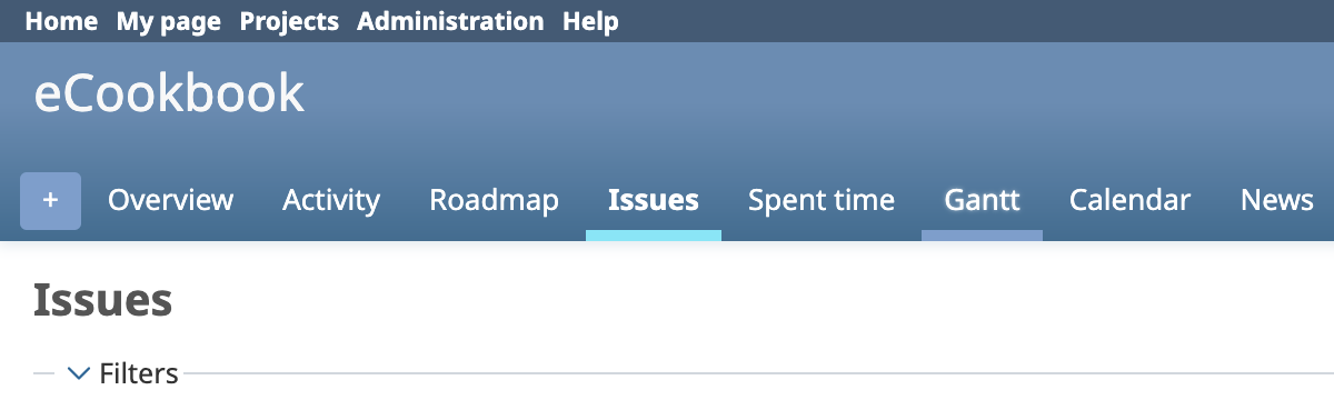
 Updated by İsmail Sahillioğlu 9 months ago
- File m2-tabs.png m2-tabs.png added
- File m2-tabs-bgcolor.png m2-tabs-bgcolor.png added
To implement your approach, the blue background in the top section should be removed completely, and the colour of the tab indicator should be derived from the colour scheme (e.g. primary color). This would make it look cleaner, similar to Google's material design: https://m2.material.io/components/tabs.

Alternatively, you could implement it without changing the background, but make the indicator and text the same colour as the surface (e.g. white). This would preserve clarity while being visually appealing.

In my humble opinion, Google's Material Design provides a very nice, clean user experience and is a good source of inspiration.