Feature #24720
closedMove all 'new item' links in project settings to above the item tables
0%
Description
I just noticed that the 'New member' link on the members tab of the project settings is placed above the table with the project members. This diverges from the UI of all the other project settings tabs (versions, issue categories, repositories and forums) where the 'New XXX' links are placed below the table.
To make the UI more consistent I'd move the 'New member' link to below the members table. Patch against source:trunk@16111 attached.
Small disclaimer: I haven't been able to run the test suite after this change, so I am not 100% sure nothing breaks.
Apart from the above, I can think of cases where it is useful to have the links both above and below the table (but only when the item tables have reached a minimum height/amount of items), but that transcends this rather small UI fix.
Files
Related issues
 Updated by Jean-Philippe Lang over 8 years ago
I agree that all the "New xxx" links should be at the same place but I think it would be more convenient (and more consistent with the screens other than in project settings) to have them above the list, no need to scroll down when there are meny items.
Is that OK for you?
 Updated by Mischa The Evil over 8 years ago
- File 0002-before.png 0002-before.png added
- File 0002-after.png 0002-after.png added
- File 0001-Move-New-.-links-to-above-item-tables-in-project-set.patch 0001-Move-New-.-links-to-above-item-tables-in-project-set.patch added
- File 0002-Add-nbsp-below-project-settings-version-filter-secti.patch 0002-Add-nbsp-below-project-settings-version-filter-secti.patch added
- File 0003-Remove-superfluous-spaces-before-colon.patch 0003-Remove-superfluous-spaces-before-colon.patch added
- Subject changed from Move 'new member' link in project settings to below the table to Move all 'new item' links in project settings to above the item tables
Jean-Philippe Lang wrote:
That is fine for me. I will leave three new patches implementing the change, of which the first replaces the one I previously posted:I agree that all the "New xxx" links should be at the same place but I think it would be more convenient (and more consistent with the screens other than in project settings) to have them above the list, no need to scroll down when there are meny items.
Is that OK for you?
- 0001-Move-New-.-links-to-above-item-tables-in-project-set.patch: moves the new links to above the item tables;
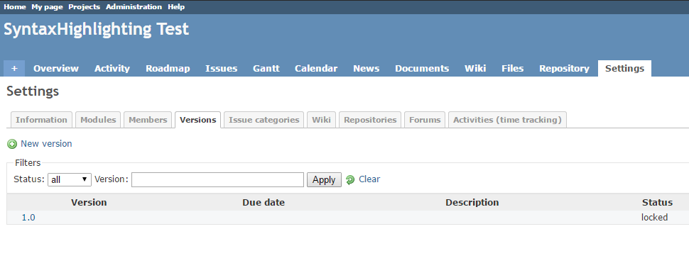
- 0002-Add-nbsp-below-project-settings-version-filter-secti.patch: after the link relocation to the top-left of the versions tab, it became pretty crowded / densely packed over there. I fixed this in line with the other two places that use comparable filter sections (admin/projects and admin/users) by adding a non-breaking space just below the filter fieldset. See the following screenshots:
- before:

- after:

- before:
- 0003-Remove-superfluous-spaces-before-colon.patch: pretty self-explanatory, I noticed them while at the code related to the UI fix.
It may be good to mention that I've also explored the (re-)use of the contextual div class for this purpose (as such tightening the consistency of new links throughout the app in both the front- ánd back-end) but found that it led to a, for me unacceptable, increase of traveled mouse distance. Besides that, I also think that a relocation of project settings' new links from the bottom-left to the top-left alone is better suited fixing the initial small UI inconsistency than a relocation from the bottom-left all the way to the top-right.
I switched to using the Git mirror again for patch creation instead of the SVN source and as such is this patch serial, against current source:/trunk@16156, produced using git format-patch which makes the individual patches apply-able using "patch -p1 < 0001-...".
 Updated by Mischa The Evil over 8 years ago
- Related to Patch #24776: UI inconsistencies on /enumerations/index view added
 Updated by Jean-Philippe Lang over 8 years ago
- Status changed from New to Closed
- Assignee set to Jean-Philippe Lang
- Resolution set to Fixed
All 3 patches are committed, thanks Mischa.
 Updated by Marius BĂLTEANU over 8 years ago
Mischa The Evil The Evil, I'm proposing some changes in a new ticket (#25853) which are related to this issue (if you want to take a look).