Feature #32856
open
Bar charts in the spent time report
Added by Takenori TAKAKI over 6 years ago. Updated almost 5 years ago.
Description
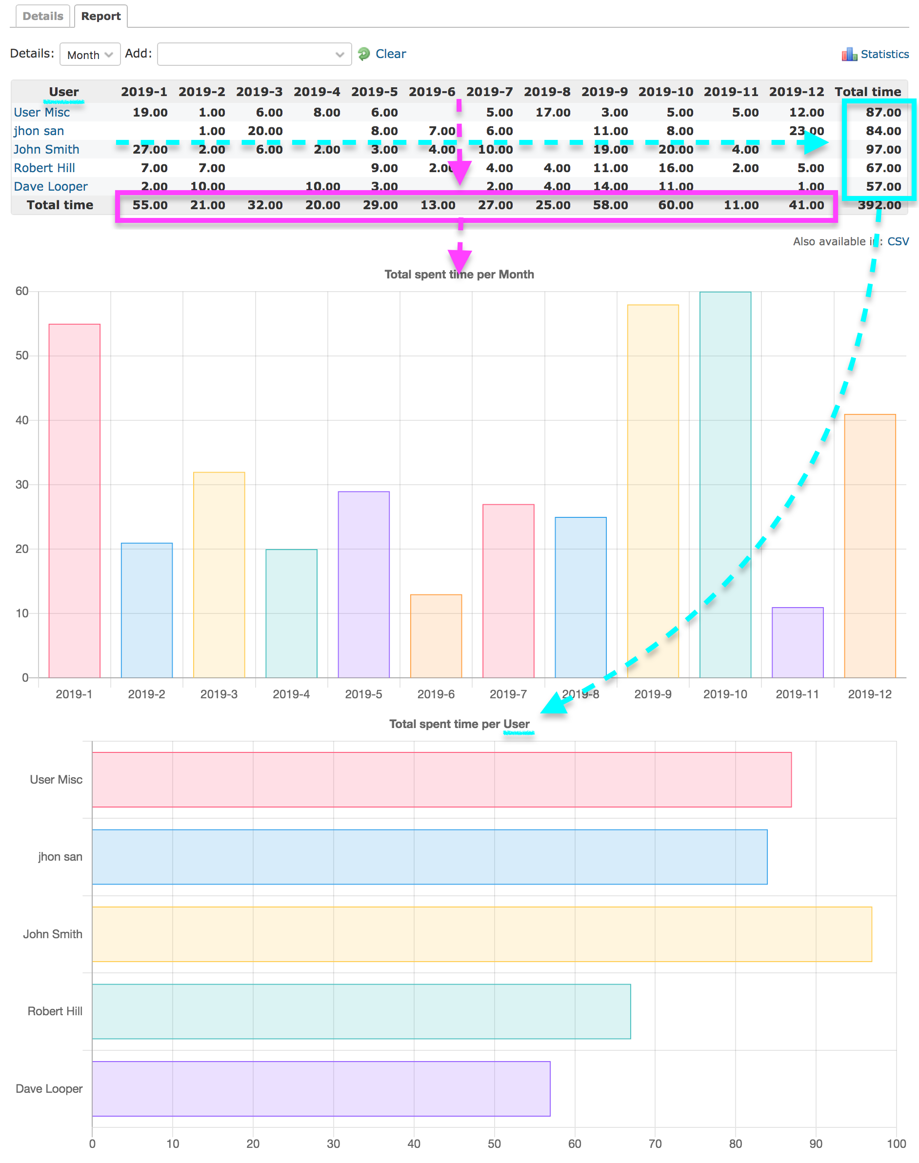
I propose a feature to visualize the results of table on the 'time_entries/report' page using bar chart.
By visualizing the sumary results in charts, we can more intuitively grasp the "time series" and "compareison result" of spent time.
The first chart shows the evolution of the total time according to the period (year, month, week, etc.), and the after second charts show the comparison of total time according to the summary axis (user, status, etc.).
Files
| bar-charts-in-the-spent-time-report.png (342 KB) bar-charts-in-the-spent-time-report.png | Takenori TAKAKI, 2020-01-23 08:42 | ||
| bar-charts-in-the-spent-time-report.patch (5.38 KB) bar-charts-in-the-spent-time-report.patch | Takenori TAKAKI, 2020-01-23 08:43 |
 Updated by Go MAEDA over 6 years ago
- Category changed from UI to Time tracking
- Target version set to Candidate for next major release
 Updated by Mischa The Evil almost 5 years ago
I think this could be a good improvement. Even more so now that we also have (similar) charts on the issues summary views introduced with #31418.
Though, OTOH, I think that we should be cautious not to add too much charts to the core and not to add charts that aren't very useful for a large part of the community.
So, for example, I'd vote +1 for core integration of Chart.js ports of (some of) the charts historically provided by the Graphs plugin by Brad Beattie (GitHub repository), but I'd vote -1 on such a proposal for specific charts supporting Agile/Scrum/etc. methodologies.
Besides the above mentioned considerations there is an additional potential issue that I've already reported as #35670 and more crudely as #35669 for the charts added per #31418. I think that if it's decided to integrate these changes, the mentioned issues should be handled first.
Updated by Mischa The Evil almost 5 years ago
- Status changed from New to Needs feedback
On a second thought I start to doubt if the addition of these charts to the core is a good idea after all. To be precise, I start doubting whether the core should provide any charts at all1.
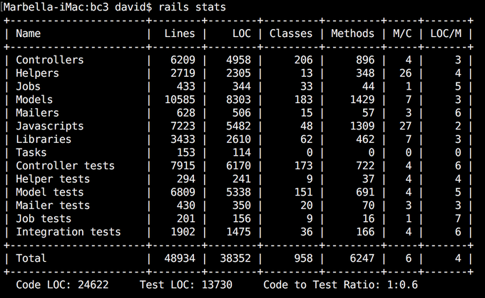
The main reason for my doubt lies in the maintainability of all the code involved. To provide some crude numbers (using a patched stats rake task2) for a (slightly patched) Redmine 4.1.x instance:
+----------------------+--------+--------+---------+---------+-----+-------+
| Name                 |  Lines |    LOC | Classes | Methods | M/C | LOC/M |
+----------------------+--------+--------+---------+---------+-----+-------+
| Controllers          |   7816 |   5774 |      53 |     476 |   8 |    10 |
| Helpers              |   6060 |   4352 |       1 |     366 | 366 |     9 |
| Models               |  17891 |  12748 |      95 |    1409 |  14 |     7 |
| JavaScripts          |   5886 |   3167 |       0 |     204 |   0 |    13 |
| Libraries            |  19128 |  13813 |     151 |    1159 |   7 |     9 |
| Controller tests     |  29105 |  23819 |      65 |    1889 |  29 |    10 |
| Helper tests         |   3467 |   2607 |      20 |     252 |  12 |     8 |
| Model tests          |  31923 |  24395 |     146 |    2623 |  17 |     7 |
| Integration tests    |   8905 |   6039 |      98 |     516 |   5 |     9 |
| System tests         |    781 |    537 |       6 |      33 |   5 |    14 |
| Extras tests         |    517 |    384 |       3 |      54 |  18 |     5 |
+----------------------+--------+--------+---------+---------+-----+-------+
| Total                | 131479 |  97635 |     638 |    8981 |  14 |     8 |
+----------------------+--------+--------+---------+---------+-----+-------+
  Code LOC: 39854     Test LOC: 57781     Code to Test Ratio: 1:1.4
Now, compare those numbers with e.g. the same numbers for Basecamp 3 (from ~2016):
 |
| -- Source: DHH on Twitter |
If you combine all this data and look at the respective size of the supporting development teams and the respective financial and economic capacity, you'll get an idea of what I'm talking about.
It might, as such, be a better choice to defer all charts/graphs to a single, dedicated plugin which could then include the repository graphs from the current core, the charts introduced in the core by #31418, the charts proposed in this issue and any additional graphs I referred to in my previous post.
I'm interested in hearing about what other people think about this...
1 that includes the long-time present repository graphs. It might be better to remove those completely and only provide a raw textual representation of this data.
2 diff of the patch.diff of the patch.
diff --git "a/lib/tasks/redmine.rake" "b/lib/tasks/redmine.rake"
index db574df16..f036ac1f8 100644
--- "a/lib/tasks/redmine.rake"
+++ "b/lib/tasks/redmine.rake"
@@ -15,6 +15,9 @@
 # along with this program; if not, write to the Free Software
 # Foundation, Inc., 51 Franklin Street, Fifth Floor, Boston, MA  02110-1301, USA.

+# Custom :stats task
+task :stats => "redmine:custom_stats"
+
 namespace :redmine do
   namespace :attachments do
     desc 'Removes uploaded files left unattached after one day.'
@@ -196,6 +199,30 @@ DESC
       end
     end
   end
+
+  task :custom_stats do
+    require 'rails/code_statistics'
+
+    ::STATS_DIRECTORIES.clear
+
+    ::STATS_DIRECTORIES <<  %w(Controllers        app/controllers)
+    ::STATS_DIRECTORIES <<  %w(Helpers            app/helpers)
+    ::STATS_DIRECTORIES <<  %w(Models             app/models)
+    # TODO: Enable once on Rails 6.1
+    #::STATS_DIRECTORIES <<  %w(Views              app/views)
+    ::STATS_DIRECTORIES <<  %w(JavaScripts        public/javascripts)
+    # TODO: Enable once on Rails 6.1
+    #::STATS_DIRECTORIES <<  %w(Stylesheets        public/stylesheets)
+    ::STATS_DIRECTORIES <<  %w(Libraries          lib/)
+    ::STATS_DIRECTORIES <<  %w(Controller\ tests  test/functional)
+    ::STATS_DIRECTORIES <<  %w(Helper\ tests      test/helpers)
+    ::STATS_DIRECTORIES <<  %w(Model\ tests       test/unit)
+    ::STATS_DIRECTORIES <<  %w(Integration\ tests test/integration)
+    ::STATS_DIRECTORIES <<  %w(System\ tests      test/system)
+    ::STATS_DIRECTORIES <<  %w(Extras\ tests      test/extra)
+
+    CodeStatistics::TEST_TYPES << "Extras tests"
+  end
 end

 # Load plugins' rake tasks