Defect #44445
closed

Selected main menu tab looks detached from the content area due to gaps above and below it
Description
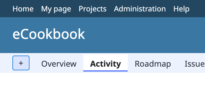
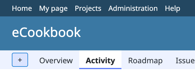
#43937 redesigned the header and changed the main menu tabs to a new style in which the selected tab is highlighted with a marker line at its bottom. In this new style, however, the selected tab looks like a detached white rectangle floating inside the menu bar rather than a tab attached to the content area below. There is a 2px strip of the menu bar background above the tab and a thin strip of about 1px below the marker line. This happens in the default theme and is especially noticeable on high-DPI displays.
The attached patch removes the vertical padding of #main-menu, sets the minimum height of #main-menu ul to 32px (the height of the menu bar), and gives the tab links a fixed 16px line height with 9px top and 7px bottom padding. The fixed line height is used so that the tab height adds up to exactly 32px without sub-pixel rounding. The selected tab and the hover highlight now fill the full height of the menu bar and touch both the header above and the content area below. The vertical position of the tab labels and the overall height of the header are unchanged. The Classic and Alternate themes are not affected.
Files
Related issues
 Updated by Go MAEDA about 1 month ago
- Related to Feature #43937: Redesign the header with a navigation bar and lighter visual weight added
 Updated by Marius BĂLTEANU about 1 month ago
In this case, we should also make the highlight of top menu full height as it was initially requested in #44341?
Updated by Go MAEDA about 1 month ago
Marius BĂLTEANU wrote in #note-2:
In this case, we should also make the highlight of top menu full height as it was initially requested in #44341?
I don't think the top menu should be changed in the same way, because the two highlights serve different purposes.
The highlight of the selected main menu tab indicates which content is currently displayed below it. The tab metaphor only works when the selected tab and the content area form one continuous surface, so the gap below the tab broke that metaphor and had to be removed. The top menu highlight, on the other hand, is only hover feedback. It does not indicate the currently displayed content, so it does not need to connect to anything below it or fill the height of the bar.
Updated by Go MAEDA about 1 month ago
Instead of making the hover highlight full height, how about rounding its corners? A slightly rounded highlight is a common style for links in a bar, and it looks like temporary feedback for the pointer, not like a part of the layout. The screenshot below shows the top menu with border-radius: 3px.

Updated by Marius BĂLTEANU about 1 month ago
- Assignee set to Marius BĂLTEANU
- Target version changed from Candidate for next minor release to 7.0.2
Updated by Marius BĂLTEANU about 1 month ago
Go MAEDA wrote in #note-4:
Instead of making the hover highlight full height, how about rounding its corners? A slightly rounded highlight is a common style for links in a bar, and it looks like temporary feedback for the pointer, not like a part of the layout. The screenshot below shows the top menu with
border-radius: 3px.
Extracted and committed in #44453.
Updated by Marius BĂLTEANU about 1 month ago
- Related to Patch #44453: Add slightly rounded corners (3px) to top menu item highlights added
Updated by Marius BĂLTEANU 26 days ago
- Status changed from New to Resolved
- Resolution set to Fixed
Committed, thanks!