Feature #13842
closed
Support mobile phone users better
Added by Marc Mengel about 13 years ago.
Updated over 10 years ago.
Description
It turns out a very few changes to the style sheets seem to make
redmine look much better from phones; You can specify a media incantation for an added stylesheet, and go to a single column layout and have it look much better. One can test the layout in Chrome just by making your window narrow enough.
The attached are patches to 1.4.1, but I don't think these bits are much different in the latest.
Files
Thanks for supporting a patch. I'm working on an improved mobile layout too. I will take a look at yours. Maybe these bits can find their way. :-)
Here is what I get on my iphone with the path applied:
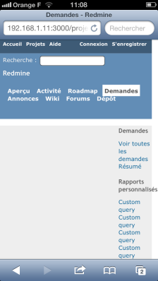
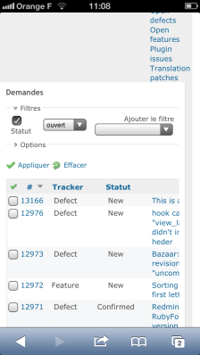
I'm not sure that it improves the overall readability.
FYI, I implemented the mobile support in my Red-Andy theme.
- Related to Feature #883: Add suport for mobile devices (CSS) added
- Related to deleted (Feature #883: Add suport for mobile devices (CSS))
- Tracker changed from Patch to Feature
- Status changed from New to Closed
- Resolution set to Duplicate
- Related to deleted (Feature #19097: Responsive layout for mobile devices)
- Is duplicate of Feature #19097: Responsive layout for mobile devices added
Also available in: Atom
PDF

 Updated by
  Updated by
  Updated by
  Updated by Toshi MARUYAMA
  Updated by