Patch #30262
open
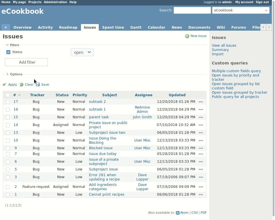
Show 'Add filter' dropdown menu as button beneath the filters
Description
Rational:
The position of the 'Add filter' select element is not very convenient and also not very intuitive.
The field is always empty and new users have a hard time figuring out how to add new filters. If there are many filters added to the query is also very tedious to always move the mouse to the top right corner to add another filter. The focus on the filters gets easily lost by this movement, too.
Proposal:
I propose to move the element beneath the added filters and to show it as a clickable button. This makes the functionality crystal clear and minimizes the distance between the last filter and the option to add another one.
Files
 Updated by Bernhard Rohloff over 7 years ago
Here is the patch to realize the shown changes.
I'm looking forward to your feedback. :-)
 Updated by
 Updated by Go MAEDA over 7 years ago
+1 except for the following points:
- The button is too large for me. The size is not consistent with other buttons
- The color of options is odd. Active options are displayed in gray and inactive ones are displayed in black. It is quite confusing. Current "Add filter" drop-down displays active options in black.
Updated by Bernhard Rohloff over 7 years ago
- File move_add_filter_select_under_filters_table.diff move_add_filter_select_under_filters_table.diff added
Go MAEDA wrote:
+1 except for the following points:
- The button is too large for me. The size is not consistent with other buttons
- The color of options is odd. Active options are displayed in gray and inactive ones are displayed in black. It is quite confusing. Current "Add filter" drop-down displays active options in black.
Thank you for your feedback! I really appreciate it. :-)
Yes, I've tested the patch on my laptop now and it really looks a bit odd. It's also very difficult to style the select box properly to the other elements as their styling depends heavily on OS and browser defaults.
I've attached a second patch without the additional styling except for a smaller width. I've also added styles to hide the already selected filter options which I think is more convenient.
 Updated by Mizuki ISHIKAWA over 7 years ago
+1
I like the idea.
The current filter addition method is not intuitive.
 Updated by Marius BĂLTEANU over 7 years ago
- File example.png example.png added
- File drdn_for_add_filters.png drdn_for_add_filters.png added
I like the idea with the following notes:
1. Moving the button under the filters, we'll not use anymore the space next to the filters and it'll add an extra row to filters fieldset regardless the screen size. Right now, I think most of the companies are using wide screens and even on my 13' screen, there is quite a lot of space unused. Please see the below screenshot.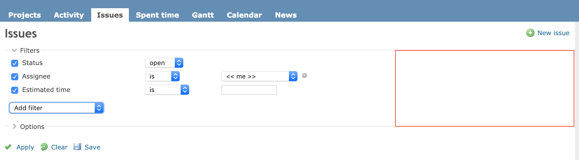
2. Maybe it is enough to move the dropdown on the same row with the last filter added?
3. What do you think if we replace the current dropdown with a custom dropdown (the same used for "Jump to project...")? It'll look like below: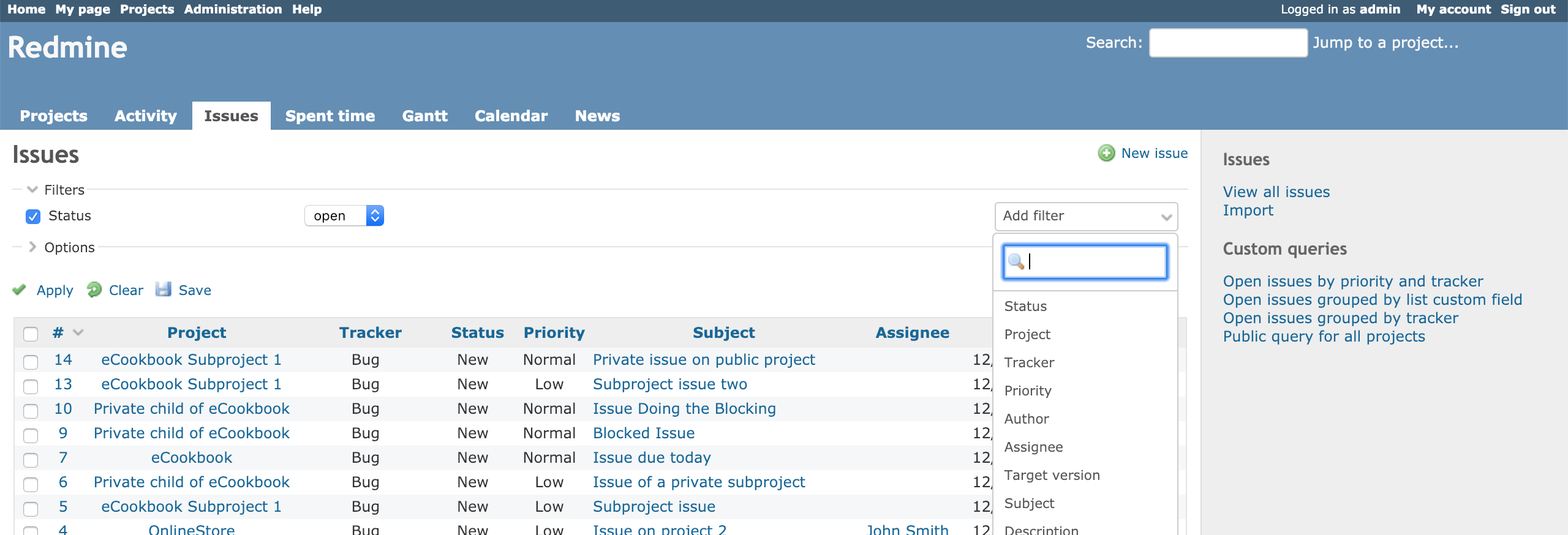
Anyway, I'll be happy with any solution that will make more obvious for the users how to add a new filter.
Updated by Bernhard Rohloff over 7 years ago
Marius BALTEANU wrote:
I like the idea with the following notes:
1. Moving the button under the filters, we'll not use anymore the space next to the filters and it'll add an extra row to filters fieldset regardless the screen size. Right now, I think most of the companies are using wide screens and even on my 13' screen, there is quite a lot of space unused. ...
That's exactly the point. A 24" widescreen monitor with 1080p or higher is a usual setup these days. On such a big screen the "Add filter" dropdown moves too far to the right side of the screen to be recognized by the user. Your eyes also have to switch focus for every additional filter which is very tedious.
I've also thought about a different presentation of the filters. Something more like the new badges or tags which you can align horizontally to save vertical space. This would be my favorite solution but it needs more effort and thinking beforehand.
3. What do you think if we replace the current dropdown with a custom dropdown (the same used for "Jump to project...")? It'll look like below:
Nice idea! I like it very much. :-)
Updated by Go MAEDA about 7 years ago
- Target version changed from 4.1.0 to Candidate for next major release
I am removing this from 4.1.0 for now because the patch that reflects #30262#note-8 and #30262#note-9 is not ready.