Patch #31147
closed
Add custom styles for all fields
Description
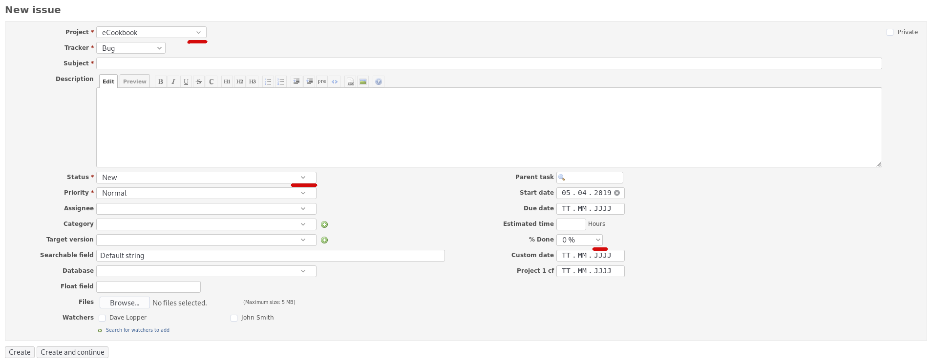
Currently, most of the fields (input, textarea, select) don't have any style and the browser renders those fields using its own style (which is different for each browser/OS). The only fields which have a custom style are the fields from login and the custom "Jump to a project" select.
Because of this, it's hard to match some custom styles with the native styles. A good example is the Edit/Preview tabs which have a different border colour from textarea.
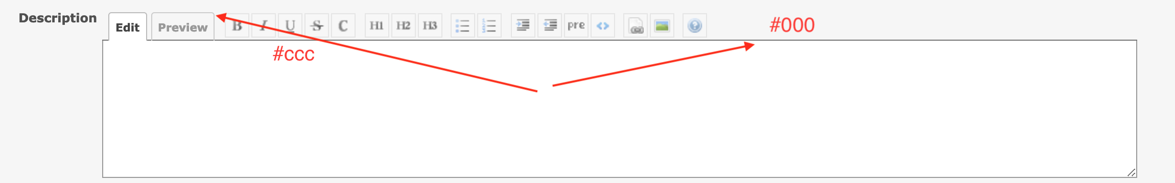
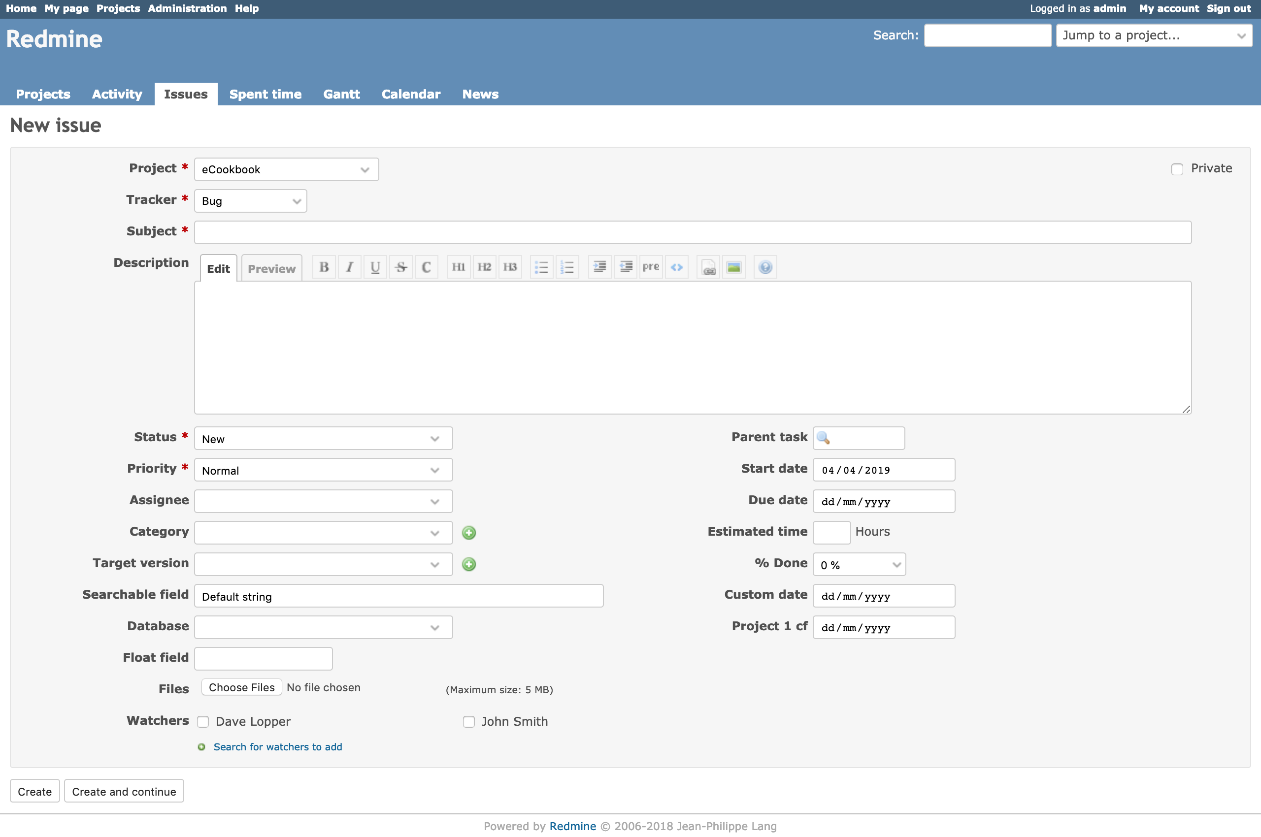
I propose to apply the existing custom style to all fields and I'm attaching 2 screenshots with the results and a patch for testing.
Files
Related issues
 Updated by Bernhard Rohloff over 7 years ago
- Related to Defect #28339: Some parts are unseen with dark theme. added
Updated by Bernhard Rohloff over 7 years ago
I've tested the patch and it looks really great with all the fields having the same style. Very professional.
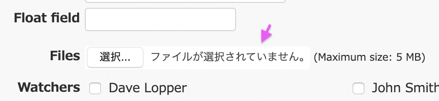
I've also found a flaw on big screens. Because the caret image is percenutally positioned its distance to the right border varies between fields of different length.
This issue is easy to fix with the calc function of CSS. Perhaps the same style should be applied to the jumpbox, too.
select {
  background: #fff url(../images/arrow_down.png) no-repeat calc( 100% - 7px) 50%;
}
 Updated by Go MAEDA over 7 years ago
- Target version set to Candidate for next major release
Updated by Go MAEDA over 7 years ago
- File issues-table@2x.png issues-table@2x.png added
- File trackers-table@2x.png trackers-table@2x.png added
- File issues-before@2x.png issues-before@2x.png added
- File button-color-in-firefox@2x.png button-color-in-firefox@2x.png added
The styles look clean and modern. It would be great if the change is delivered in 4.1.0.
But I found some small issues.
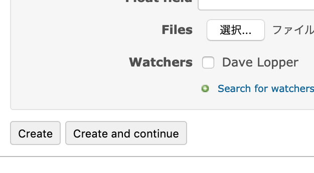
1. The hight of the rows is too tall if the row has a checkbox
The height of rows in the issues table and the spent time table will be taller than other tables. I think the height of the issues and spent time table should be the same with other tables for the consistency of UI.
[Issues table without the patch]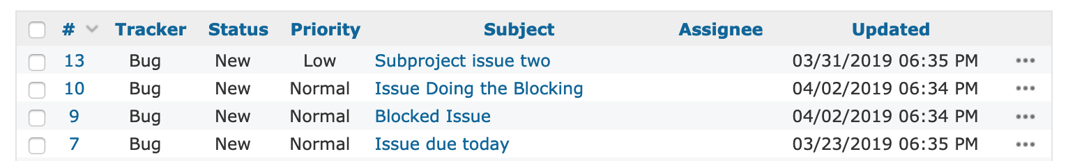
[Issues table with the patch]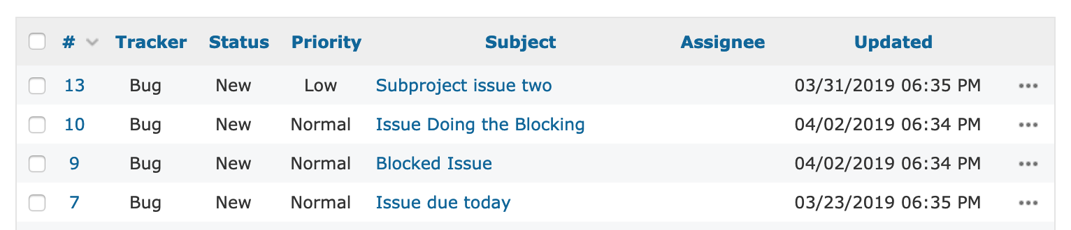
[Trackers table with the patch]![]()
2. The button color is gray in Firefox
Updated by Bernhard Rohloff over 7 years ago
IMHO the extra space between the lines helps my eyes to keep track on a specific row. It would be great to keep the extra space and style the missing tables the same way. But I think, that should be a topic of another issue, right. :)
 Updated by Marius BĂLTEANU over 7 years ago
Bernhard Rohloff wrote:
This issue is easy to fix with the
calcfunction of CSS. Perhaps the same style should be applied to the jumpbox, too.
Go MAEDA wrote:
1. The hight of the rows is too tall if the row has a checkbox
2. The button color is gray in Firefox
Thank you for testing the patch. I've fixed all 3 in the attached patch.
Updated by Marius BĂLTEANU over 7 years ago
- File deleted (
0001-Styles-for-fields.patch)
Updated by Go MAEDA over 7 years ago
- Target version changed from Candidate for next major release to 4.1.0
Thank you for updating the patch. It looks REALLY good to me.
Setting the target version to 4.1.0.
Updated by Go MAEDA over 7 years ago
- Status changed from New to Closed
- Assignee set to Go MAEDA
Committed the patch. Thank you for improving Redmine.
Updated by Bernhard Rohloff over 7 years ago
- File overlapping_caret.png overlapping_caret.png added
- Status changed from Closed to Reopened
I found another flaw in the implementation.
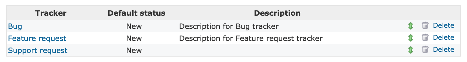
Head over to administration > settings and look for protocol and wiki history compression.
The select fields are too small and there is not enough padding on the right hand side to show the caret icon correctly.
![]()
Updated by Bernhard Rohloff over 7 years ago
- Status changed from Reopened to Closed
Hold on! Everything's fine. My testing environment was using the alternate theme so it's not related to Marius' patch.
Updated by Marius BĂLTEANU about 7 years ago
- Related to Patch #31204: Add hover styles to buttons added
Updated by Bernhard Rohloff about 7 years ago
- Related to Defect #31216: Multiselect elements don't expand anymore added
Updated by Go MAEDA about 7 years ago
- Related to Defect #31238: The input field of the Gantt chart page is narrow added
Updated by Marius BĂLTEANU about 7 years ago
- Status changed from Closed to Reopened
Please commit the below small change in order to remove some unnecessary padding.
diff --git a/public/stylesheets/application.css b/public/stylesheets/application.css
index dbafe14..e347f64 100644
--- a/public/stylesheets/application.css
+++ b/public/stylesheets/application.css
@@ -460,7 +460,7 @@ select {
   background: #fff url(../images/arrow_down.png) no-repeat calc( 100% - 7px) 50%;
   padding-right: 20px;
 }
-input[type="file"] {border: 0;}
+input[type="file"] {border: 0; padding-left: 0; padding-right: 0;}
 input[type="submit"] {-webkit-appearance: button; cursor: pointer; background-color: #fff;}
 select[multiple=multiple] {background: #fff; padding-right: initial; height: auto;}
 fieldset {border: 1px solid #e4e4e4; margin:0; min-width: inherit;}
Updated by Go MAEDA about 7 years ago
- Status changed from Reopened to Closed
Marius BALTEANU wrote:
Please commit the below small change in order to remove some unnecessary padding.
[...]
Confirmed and committed the fix. Thank you.
Updated by Go MAEDA about 7 years ago
- Blocked by Defect #31358: No triangle to open dropdowns in Internet Explorer and Edge added
Updated by Go MAEDA about 7 years ago
- Status changed from Reopened to Closed
Committed the fix for issue #31358.
Updated by Go MAEDA about 7 years ago
- Status changed from Closed to Reopened
I have reported an issue regarding this change as #31371.
Updated by Go MAEDA about 7 years ago
- Blocked by Defect #31371: "Stay logged in" checkbox in Sign in page is misaligned after r18056 added
Updated by Bernhard Rohloff about 7 years ago
We also should set the color of the fields background and font to provide a consistent style on dark themed desktops, too.
If you edit an issue on a GTK desktop with Advaita-dark theme for example it looks like this: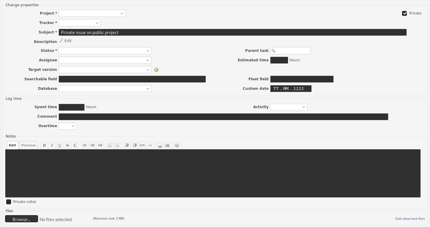
Index: public/stylesheets/application.css
===================================================================
--- public/stylesheets/application.css  (Revision 18164)
+++ public/stylesheets/application.css  (Arbeitskopie)
@@ -450,7 +450,7 @@

 form {display: inline;}
 input, select {vertical-align: middle; margin-top: 1px; margin-bottom: 1px; height: 24px; padding: 0 7px;}
-input, select, textarea {border:1px solid #ccc; border-radius:3px; box-sizing: border-box;}
+input, select, textarea { color: #333; background-color: #fff; border:1px solid #ccc; border-radius:3px; box-sizing: border-box;}
 select {
   -webkit-appearance: none;
   -moz-appearance: none;
Updated by Marius BĂLTEANU about 7 years ago
Go Maeda, just to know, you have committed the change proposed above by Bernhard as part of the #31391.
Updated by Marius BĂLTEANU about 7 years ago
Go MAEDA wrote:
Marius BALTEANU wrote:
Go Maeda, just to know, you have committed the change proposed above by Bernhard as part of the #31391.
Sorry, I didn't know the mistake. Do you think if I should revert r18175 and commit #31391 again?
Not really, I think it is enough to revert only the CSS change and committed it again as part of this ticket.
Updated by Go MAEDA about 7 years ago
- Status changed from Reopened to Closed
Committed the patch in #31147#note-22. Thanks.
Updated by Marius BĂLTEANU about 7 years ago
- Status changed from Closed to Reopened
One more fix for an issue introduced by r18177:
vagrant@jessie:/vagrant/project/redmine$ git diff
diff --git a/public/stylesheets/application.css b/public/stylesheets/application.css
index 03fd814..c4b138f 100644
--- a/public/stylesheets/application.css
+++ b/public/stylesheets/application.css
@@ -464,7 +464,7 @@ select {
   background-position: calc(100% - 7px) 50%;
   padding-right: 20px;
 }
-input[type="file"] {border: 0; padding-left: 0; padding-right: 0;}
+input[type="file"] {border: 0; padding-left: 0; padding-right: 0; background-color: initial; }
 input[type="submit"] {
   -webkit-appearance: button;
   cursor: pointer;
Updated by Go MAEDA about 7 years ago
- File note-27@2x.png note-27@2x.png added
Updated by Go MAEDA about 7 years ago
- Status changed from Reopened to Closed
Committed the fix #31147#note-27 in r18186.
Updated by Go MAEDA almost 7 years ago
- Related to Patch #31971: Change the color of the input field frame when in focus added
Updated by Marius BĂLTEANU almost 7 years ago
- File after.png after.png added
- File current.png current.png added
- Status changed from Closed to Reopened
We should make the disabled fields more obvious using the below patch:
Mariuss-MacBook-Pro:redmine mariusbalteanu$ git diff
diff --git a/public/stylesheets/application.css b/public/stylesheets/application.css
index 95f857074..026e30013 100644
--- a/public/stylesheets/application.css
+++ b/public/stylesheets/application.css
@@ -522,6 +522,11 @@ textarea:focus, textarea:active {
   outline: none;
 }

+input:disabled, select:disabled, textarea:disabled {
+  cursor: not-allowed;
+  color: graytext;
+}
+
1. Current: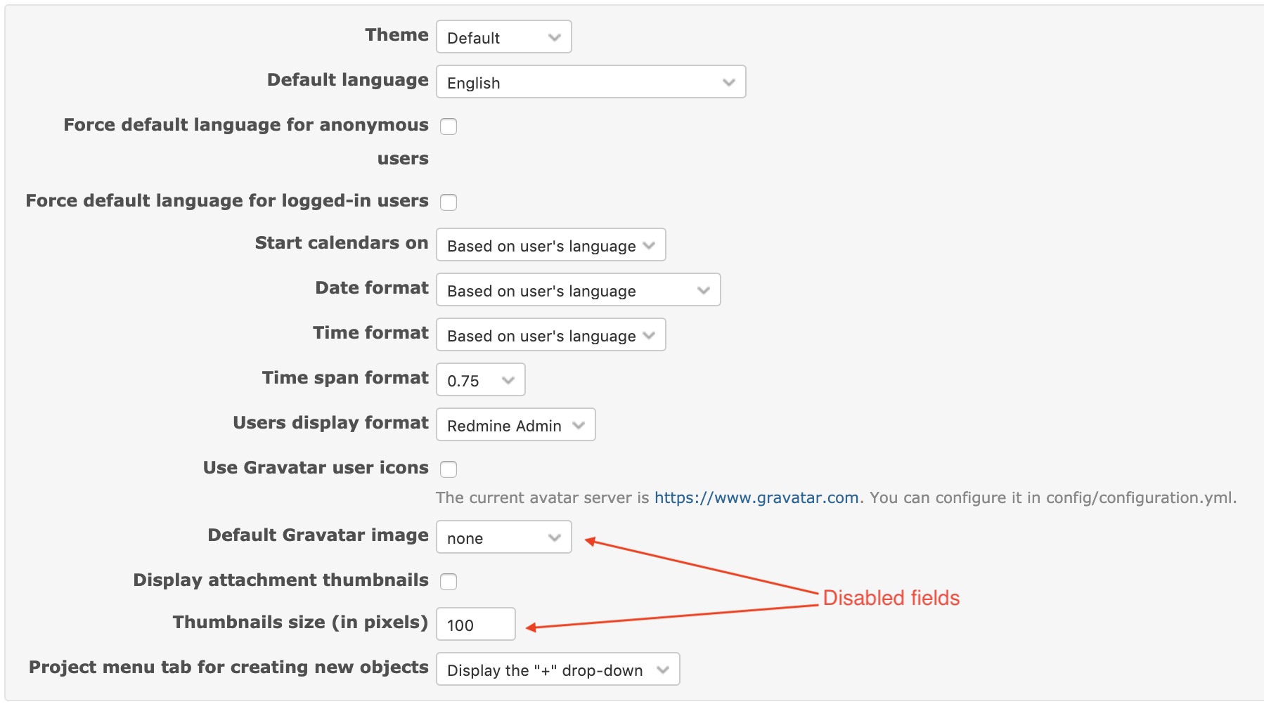
2. After: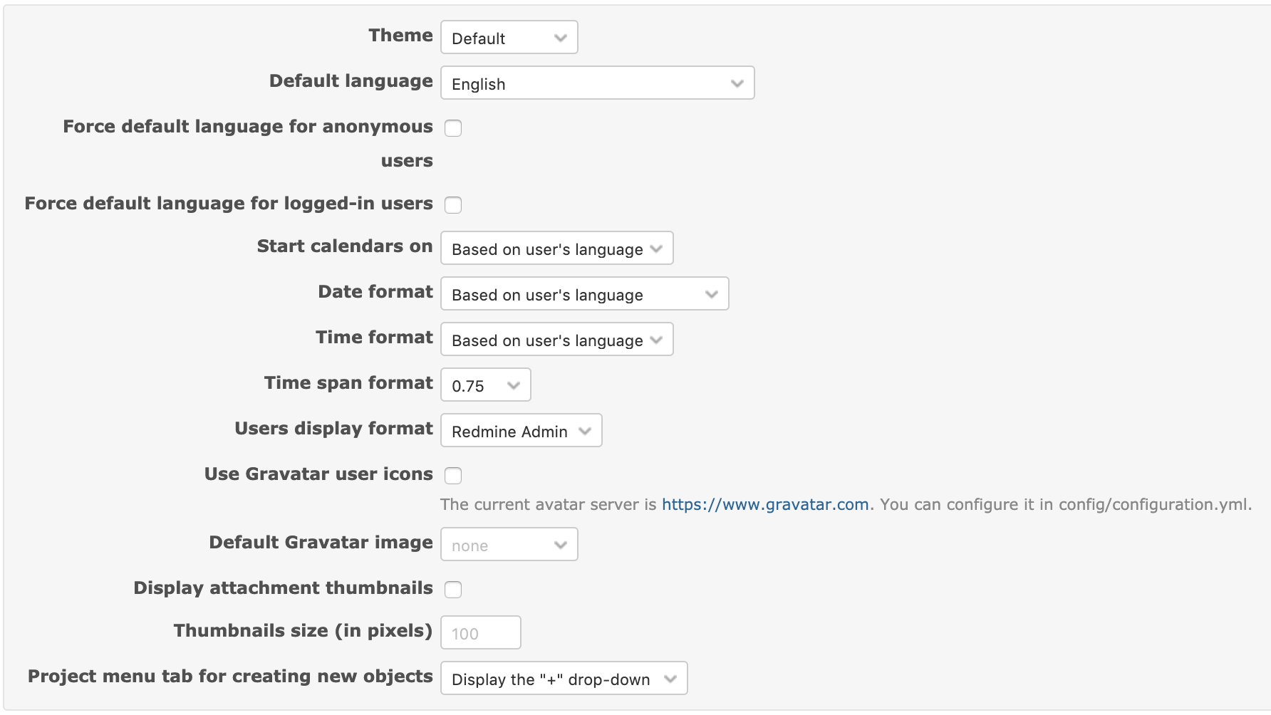
Updated by Go MAEDA almost 7 years ago
- Status changed from Reopened to Closed
Marius BALTEANU wrote:
We should make the disabled fields more obvious using the below patch:
Committed the fix in r18548. Thank you.
Updated by Go MAEDA almost 7 years ago
- Related to Defect #32206: Options in a drop-down overlap the down arrow when Alternate theme is used added
Updated by Bernhard Rohloff over 6 years ago
- Related to Defect #32981: Unable to distinguish disabled input fields added
Updated by Bernhard Rohloff over 5 years ago
- Related to Defect #24829: Dropdown Mobile view menu partially unreadable added