Patch #31971
closed
Change the color of the input field frame when in focus
Description
In Redmine 4.0, the frame color changed when the input field was focused.
When the trunk Redmine is run on a browser such as Firefox, the frame color no changes.
I attached a patch to change the frame color.
Screenshot after patching: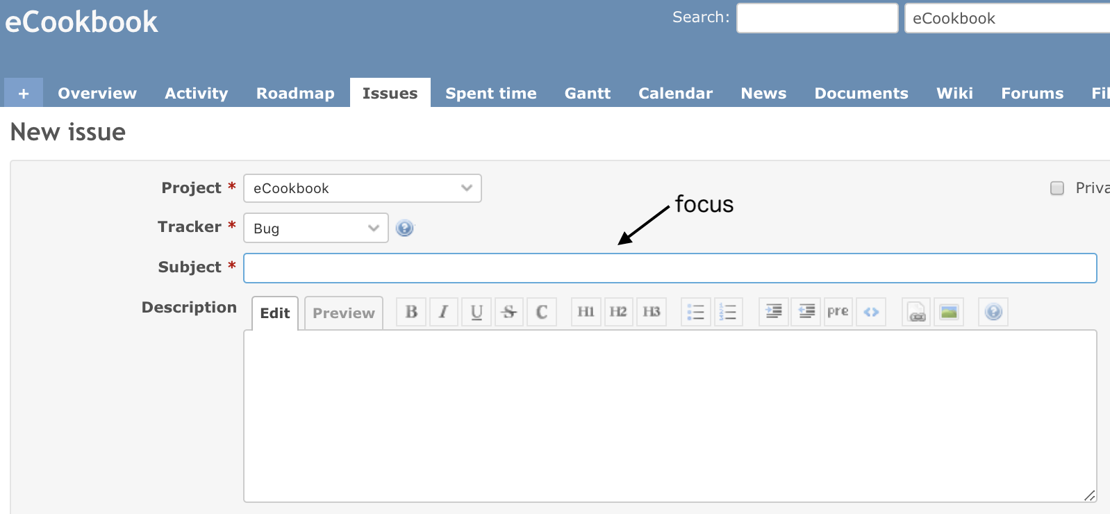
Files
Related issues
 Updated by Go MAEDA almost 7 years ago
- Related to Patch #31147: Add custom styles for all fields added
 Updated by kim kk almost 7 years ago
Subjectの部分を一回目クリックした場合は、
Hoverしたデータのリストが表示されますが、
他のText Areaをクリックした後、再度Subjectをクリックしても、
Hoverしたデータのリストが表示されないです。
Sorry. English is no good. use Japanese.
Updated by Go MAEDA almost 7 years ago
kim kk wrote:
Sorry. English is no good. use Japanese.
Thank you for your feedback. I will add English translation to #31971#note-2 later.
Updated by Go MAEDA almost 7 years ago
kim kk wrote:
Subjectの部分を一回目クリックした場合は、
Hoverしたデータのリストが表示されますが、
他のText Areaをクリックした後、再度Subjectをクリックしても、
Hoverしたデータのリストが表示されないです。
Do you mean that the patch breaks the auto-complete feature? I could not reproduce the problem. The patch changes only the appearance of elements, so I think it does not affect auto-complete.
Could you describe the detailed steps to reproduce and attach screenshots?
Updated by Go MAEDA almost 7 years ago
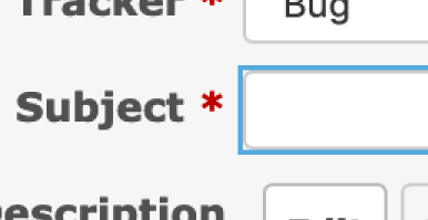
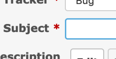
- File corners-not-rounded.png corners-not-rounded.png added
- File rounded-outline.png rounded-outline.png added
I tried out the patch with Firefox. It made the appearance nicer but I round a problem. Input fields have rounded corners, but the corners of the outline are not rounded.
How about updating the patch as follows? I think it makes the appearance much nicer.
diff --git a/public/stylesheets/application.css b/public/stylesheets/application.css
index b66a07e7d..7c5eb5838 100644
--- a/public/stylesheets/application.css
+++ b/public/stylesheets/application.css
@@ -484,6 +484,16 @@ input[type="submit"] {
 input[type="submit"]:hover {
   background-color: #ddd;
 }
+
+input[type="text"]:focus, input[type="text"]:active,
+input[type="password"]:focus, input[type="password"]:active,
+input[type="date"]:focus, input[type="date"]:active,
+select:focus, select:active,
+textarea:focus, textarea:active {
+  border: 1.5px solid #5ad;
+  outline: none;
+}
+
 select[multiple=multiple] {background: #fff; padding-right: initial; height: auto;}
 fieldset {border: 1px solid #e4e4e4; margin:0; min-width: inherit;}
 legend {color: #333;}
Updated by Go MAEDA over 6 years ago
- Target version set to 4.1.0
Setting the target version to 4.1.0.
 Updated by Mizuki ISHIKAWA over 6 years ago
Go MAEDA wrote:
I tried out the patch with Firefox. It made the appearance nicer but I round a problem. Input fields have rounded corners, but the corners of the outline are not rounded.
How about updating the patch as follows? I think it makes the appearance much nicer.[...]
The change looks better!
I think it would be better to change "border: 1.5px" to “border: 1px” to match the existing border style.
diff --git a/public/stylesheets/application.css b/public/stylesheets/application.css
index 04fc3ae12..edf96d4fe 100644
--- a/public/stylesheets/application.css
+++ b/public/stylesheets/application.css
@@ -484,6 +484,16 @@ input[type="submit"] {
 input[type="submit"]:hover {
   background-color: #ddd;
 }
+
+input[type="text"]:focus, input[type="text"]:active,
+input[type="password"]:focus, input[type="password"]:active,
+input[type="date"]:focus, input[type="date"]:active,
+select:focus, select:active,
+textarea:focus, textarea:active {
+  border: 1px solid #5ad;
+  outline: none;
+}
+
 select[multiple=multiple] {background: #fff; padding-right: initial; height: auto;}
 fieldset {border: 1px solid #e4e4e4; margin:0; min-width: inherit;}
 legend {color: #333;}
Updated by Go MAEDA over 6 years ago
Mizuki ISHIKAWA wrote:
The change looks better!
I think it would be better to change "border: 1.5px" to “border: 1px” to match the existing border style.
Thank you for your feedback. I think the patch in #31971#note-7 is ready to commit.
Updated by Go MAEDA over 6 years ago
- Status changed from New to Closed
- Assignee set to Go MAEDA
Committed the patch. Thank you.
 Updated by Marius BĂLTEANU over 6 years ago
- Status changed from Closed to Reopened
Go Maeda, Mizuki, is there any reason for why you chose to target each type of input instead of using input?
Mariuss-MacBook-Pro:redmine mariusbalteanu$ git diff
diff --git a/public/stylesheets/application.css b/public/stylesheets/application.css
index 95f857074..169b1ef48 100644
--- a/public/stylesheets/application.css
+++ b/public/stylesheets/application.css
@@ -512,10 +512,7 @@ input[type="submit"]:hover {
   background-color: #ddd;
 }

-input[type="text"]:focus, input[type="text"]:active,
-input[type="password"]:focus, input[type="password"]:active,
-input[type="date"]:focus, input[type="date"]:active,
-input[type="number"]:focus, input[type="number"]:active,
+input:focus, input:active,
 select:focus, select:active,
 textarea:focus, textarea:active {
   border: 1px solid #5ad;
Updated by Marius BĂLTEANU over 6 years ago
- Status changed from Reopened to Closed