Actions
Feature #33692
closed
Improved view of the activity page
Resolution:
Fixed
Description
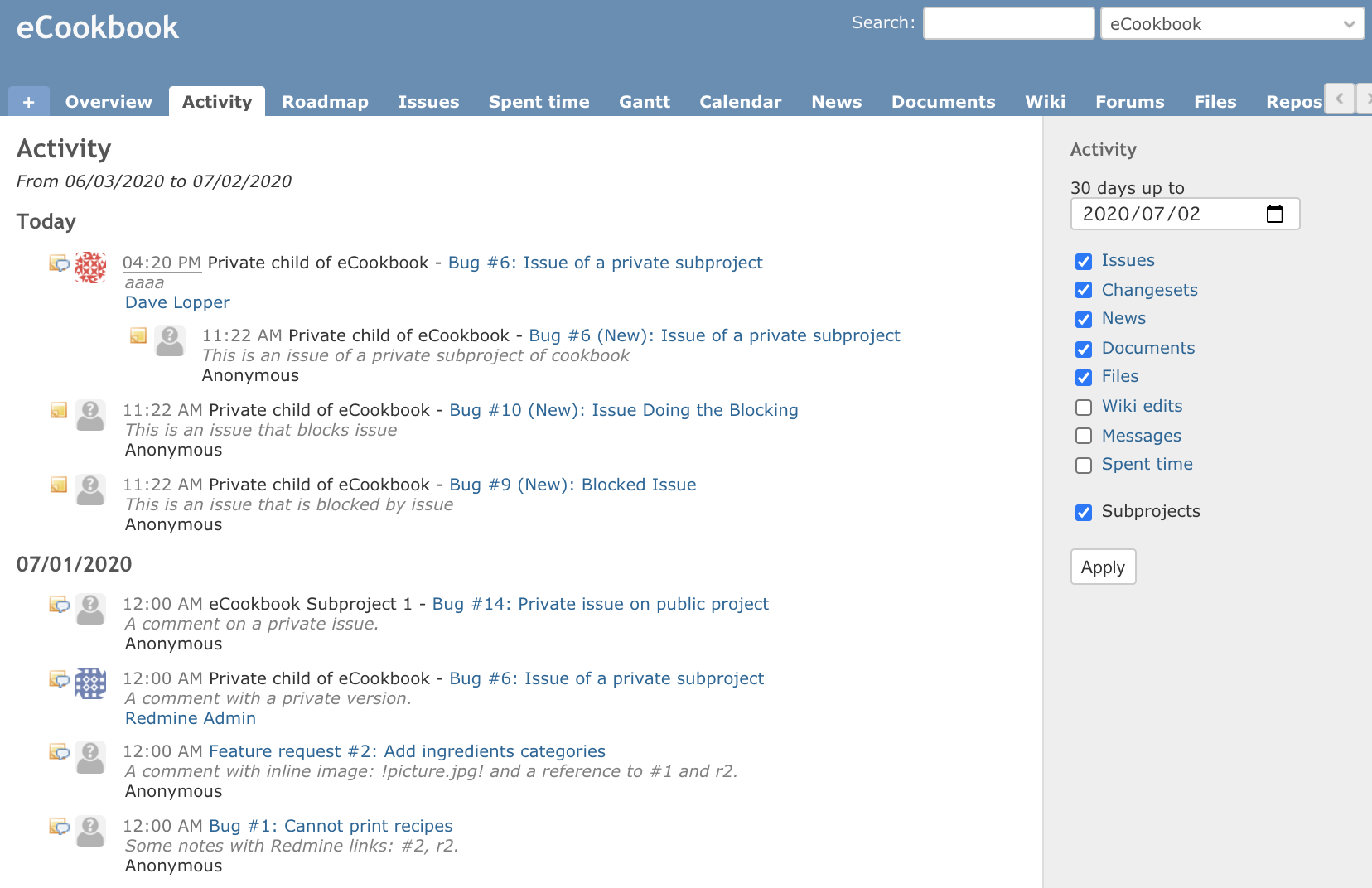
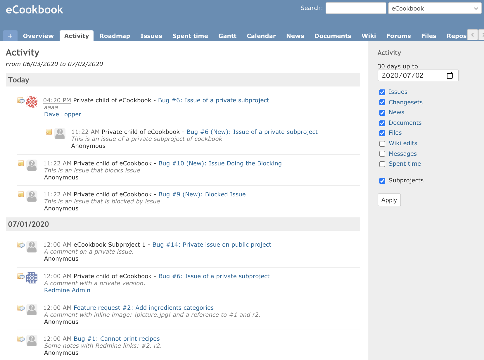
Applying this patch (update-activity-layout.diff) will change the layout of the activity page as shown in the image below.
- Dates are more emphasized and easier to find
- The gap between the activity history has been slightly widened and a line has been added. I think the original layout is stuffed with letters and hard to read.
| Change before | Change after |
 |
 |
Files
 Updated by
 Updated by Akiko Takano about 6 years ago
+1
It makes easy to understand daily activities.
 Updated by
 Updated by Go MAEDA about 6 years ago
- Target version set to Candidate for next major release
Updated by Go MAEDA about 6 years ago
- Target version changed from Candidate for next major release to 4.2.0
Looks really nice. Setting the target version to 4.2.0.
Updated by Go MAEDA about 6 years ago
- Tracker changed from Patch to Feature
- Subject changed from Improve the layout of the activity page to Improved view of the activity page
How about removing the horizontal lines between activity items and just adding padding-top: 10px? For me, the horizontal lines are a bit distracting.
diff --git a/public/stylesheets/application.css b/public/stylesheets/application.css
index 4747681f9..28dc9488d 100644
--- a/public/stylesheets/application.css
+++ b/public/stylesheets/application.css
@@ -601,7 +601,14 @@ div#activity span.project:after, #search-results span.project:after { content: "
 div#activity dd span.description, #search-results dd span.description { display:block; color: #808080; }
 div#activity dt.grouped {margin-left:5em;}
 div#activity dd.grouped {margin-left:9em;}
-div#activity dt.icon {background-position: 0 0px !important;}
+div#activity dt.icon {background-position: 0 10px !important;}
+div#activity h3 {
+  padding: 5px;
+  background-color: #eeeeee;
+}
+div#activity dt {
+  padding-top: 10px;
+}

 #search-results dd { margin-bottom: 1em; padding-left: 20px; margin-left:0px; }
 Updated by Miodrag Milic about 6 years ago
I like the lines. Its important to know when day ends, such 'distraction' has merit.
 Updated by Mizuki ISHIKAWA about 6 years ago
I like layouts that are clearly separated by lines
I think that the impression that there are many characters and it is difficult to see does not change just by adding padding.
Github and Gitlab activities are also separated by lines.
Updated by Go MAEDA about 6 years ago
Thank you all for the feedbacks. I am going to commit the patch without any change.
Updated by Go MAEDA about 6 years ago
- Status changed from New to Closed
- Assignee set to Go MAEDA
- Resolution set to Fixed
Committed the patch. Thank you for improving Redmine.
Actions