Feature #19097
closed
Responsive layout for mobile devices
Added by Jan from Planio www.plan.io about 9 years ago. Updated over 8 years ago.
0%
Description
There have been a number of attempts to make Redmine more mobile-friendly, most of which have been incorporated in themes.
However, I believe that "mobile-friendliness" (e.g. a responsive layout) has nothing to do with the main purpose of themes.
IMO, the main purpose of themes is adding a custom design, like colors, icons, fonts, etc. Mobile-friendlyness on the other hand, should be a core feature for any modern web application. At Planio, we've been developing such a responsive layout during the past weeks and I would like to contribute this back to the Redmine community. In fact, I would really enjoy seeing this go into the Redmine core.
It has no dependencies on Planio itself or on any theme. In fact, it also tries to also cause minimal disruption to existing themes. On the standard (desktop, i.e. >900px) view, existing themes should just work like before.
Moreover, only a few minimal changes should be required by theme developers to make their existing themes work and look good on smaller screens.
Current status
The patch consists of a few changes to the base layout, some JavaScript (for the right side fly-out menu) and a self-contained stylesheet file. In this first step, the stylesheet tries to reach a minimum setup in order to achieve basic responsiveness for Redmine. The following things were kept in mind:
- In Redmine, anything that is below 900px has a horizontal scrollbar anyways and therefore does not fit in viewport, so start adding responsiveness here
- Use as little JavaScript as possible -> try CSS solution first
- Don't use workarounds for IE below 9 to keep things easy
How to make existing themes work
Almost all existing themes we tested, work great on regular desktop screens. In fact, they also work with the mobile layout out of the box. To make them more beautiful, only a few tweaks to the respective theme CSS are required:
The colors mentioned here are all standard Redmine theme colors. That should make a find & replace for existing theme developers easier.
/* Header background color */
#wrapper  #header {
  background-color: #628db6;
}

/* Mobile toggle button colors */
#wrapper #header a.mobile-toggle-button {
  border-left-color: #dddddd;
  color: #f8f8f8;
}

/* Flyout menu colors */
#wrapper .flyout-menu {
  color: #ffffff;
  background-color: #3e5b76;
}

/* Flyout menu border color */
#wrapper .flyout-menu__avatar, #wrapper .flyout-menu ul li a {
  border-top-color: rgba(255,255,255,.1); /* white with alpha transparency */
}

/* Flyout menu link color */
#wrapper .flyout-menu a, #wrapper .flyout-menu__avatar a {
  color: #ffffff;
}

/* Flyout menu headings background */
#wrapper .flyout-menu h3 {
  background-color: #628db6;
}

/* Flyout menu headings text color */
#wrapper .flyout-menu h3, #wrapper .flyout-menu h4 {
  color: #ffffff;
}

/* Search magnifying glass label color */
#wrapper .search-magnifier {
  color: #bbbbbb;
}

/* Project menu dropdown arrow color */
#wrapper .jump-box-arrow {
     color: #ffffff;
}
These are all CSS classes which we believe most existing theme developers should need to adapt in order to make their theme look good with the responsive layout.
What's left to to?
We will be working on making individual views more mobile-friendly as well. This will be a step-by-step process where we will try to work on the important parts (issues list, issue forms) first and then work our way back to the not so important views.
However, since this patch already improves the status quo on mobile devices and is self-contained, I'd say it could already be committed.
Files
Related issues
 Updated by Jan from Planio www.plan.io about 9 years ago
- Description updated (diff)
 Updated by Go MAEDA about 9 years ago
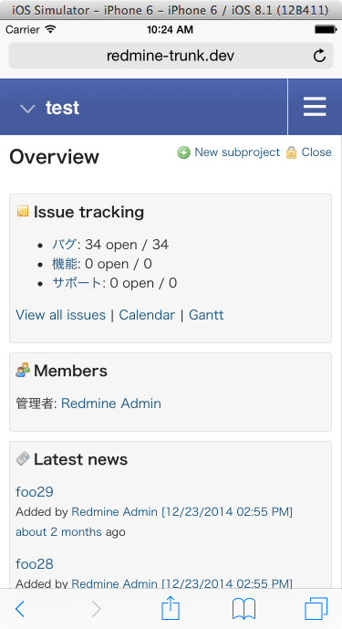
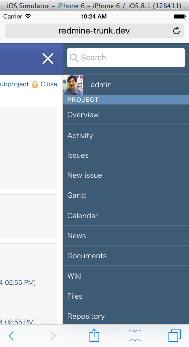
- File screenshot-iphone6-overview.png screenshot-iphone6-overview.png added
- File screenshot-iphone6-menu.png screenshot-iphone6-menu.png added
It really looks very nice.
") Updated by Jan Niggemann (redmine.org team member) about 9 years ago
Updated by Jan Niggemann (redmine.org team member) about 9 years ago
Looks really good indeed! I think that a lot of our users would welcome such a responsive layout.
Updated by Jan from Planio www.plan.io about 9 years ago
Thanks guys for the praise. And thanks for trying it out and posting the screenshots, I meant to make some as well but forgot :)
I'll repaste them here:
Updated by Jan from Planio www.plan.io about 9 years ago
- File 0002-Add-smooth-scrolling-for-webkit-browsers.patch 0002-Add-smooth-scrolling-for-webkit-browsers.patch added
Here's a second patch which fixes scrolling in the basecamp (and possibly other) theme(s)
 Updated by
  Updated by
Updated by Jan from Planio www.plan.io about 9 years ago
- Related to Feature #883: Add suport for mobile devices (CSS) added
Updated by Jan from Planio www.plan.io about 9 years ago
- Related to Feature #13842: Support mobile phone users better added
Updated by Jan from Planio www.plan.io about 9 years ago
- Related to Feature #1277: Add iPhone specific view added
 Updated by Felix Gliesche about 9 years ago
- File 0001-Responsive-layout.patch added
I am attaching a rebased version of the initial patch in order for this patch to work for latest code changes on redmine.
Updated by Jan from Planio www.plan.io about 9 years ago
- File deleted (
0001-Responsive-layout.patch)
Updated by Jan from Planio www.plan.io about 9 years ago
- File 0003-Prevent-zooming-on-mobile-browsers.patch 0003-Prevent-zooming-on-mobile-browsers.patch added
This additional patch prevents mobile browsers from zooming into form fields (and zooming in general) which is not wanted in a responsive layout.
Updated by Jan from Planio www.plan.io about 9 years ago
- File 0004-Style-contextual-buttons.patch 0004-Style-contextual-buttons.patch added
- File redmine_responsive_contextual1.png redmine_responsive_contextual1.png added
- File redmine_responsive_contextual2.png redmine_responsive_contextual2.png added
This additional patch adds style for contextual buttons which are found in many places in Redmine above (or below) the main content. It works with many themes out of the box and helps tapping contextual icons with fingers (on smartphone touchscreens) rather than a mouse pointer.
I'm also attaching some additional screenshots:
Updated by Jan from Planio www.plan.io about 9 years ago
This additional patch adds page specific style for the login screen to properly align with the (smaller) screen size.
 Updated by Jens Krämer about 9 years ago
- File 0006-fixes-for-JS-issues-caused-by-flyout-menu.patch added
This patch fixes some minor issues that were caused by rendering the sidebar a second time for the flyout menu which leads to duplicate HTML element ids.
Updated by Jens Krämer about 9 years ago
- File 0006-fixes-for-JS-issues-caused-by-flyout-menu.patch added
added one more fix - slight change to my/_sidebar.html.erb to use api-access-key class instead of id.
Updated by Jan from Planio www.plan.io about 9 years ago
- File deleted (
0006-fixes-for-JS-issues-caused-by-flyout-menu.patch)
Updated by Jan from Planio www.plan.io about 9 years ago
- File 0007-Align-watchers-area-well-in-mobile-menu.patch 0007-Align-watchers-area-well-in-mobile-menu.patch added
- File 0008-Make-loading-indicator-wider.patch 0008-Make-loading-indicator-wider.patch added
Attached are another two patches which make the watchers in the sidebar and the ajax loading indicator look more beautiful.
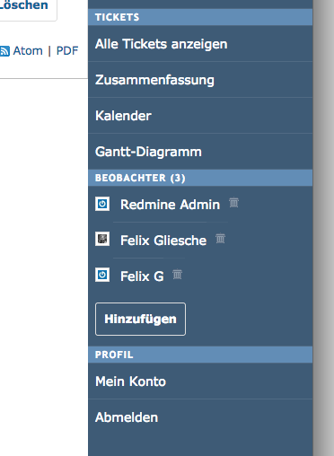
Updated by Jan from Planio www.plan.io about 9 years ago
- File watchers_sidebar.png watchers_sidebar.png added
Watchers now look like this in the sidebar:
Updated by Jens Krämer about 9 years ago
- File 0006-fixes-for-JS-issues-caused-by-flyout-menu.patch added
revised patch to keep api-access-key-id for compatibility with RedminePM app.
Updated by Jan from Planio www.plan.io about 9 years ago
- File deleted (
0006-fixes-for-JS-issues-caused-by-flyout-menu.patch)
Updated by Jan from Planio www.plan.io about 9 years ago
- Related to Patch #19468: Replace jQuery UI Datepicker with native browser date fields when available added
Updated by Felix Gliesche about 9 years ago
- File 0009-Make-UI-Dialogs-responsive.patch 0009-Make-UI-Dialogs-responsive.patch added
- File 0010-Add-responsiveness-to-tabular-forms.patch 0010-Add-responsiveness-to-tabular-forms.patch added
- File 0011-Optimize-issues-new-form-for-mobile-devices.patch 0011-Optimize-issues-new-form-for-mobile-devices.patch added
I am adding three patches that start optimizing forms for mobile devices:
- UI dialogs are made responsive (e.g. adding a watcher in new/issue form)
- Tabular forms are optimized for mobile
- Form for creating issues (issue/new) was adjusted as one of the most important forms on redmine
While most tabular forms that are being used in other places look already great, we will be optimizing these forms specifically step by step and add the corresponding patches here soon.
Updated by Jan from Planio www.plan.io almost 9 years ago
- File 0001-Responsive-layout.patch added
It turns out that for a number of reasons, the initial approach of duplicating menus and sidebar as proposed in patch 0001 is not ideal. As 0006 shows, a number of things can break due to this whenever code relies on the fact that stuff only exists once. Therefore, we've adapted patch 0001. It now moves the menus and sidebar using Javascript in case of small screen widths. This should be much safer.
Patch 0006 becomes obsolete with this. The entire series applies cleanly to current Redmine trunk.
Updated by Jan from Planio www.plan.io almost 9 years ago
- File deleted (
0006-fixes-for-JS-issues-caused-by-flyout-menu.patch)
Updated by Jan from Planio www.plan.io almost 9 years ago
- File deleted (
0001-Responsive-layout.patch)
Updated by Jan from Planio www.plan.io almost 9 years ago
- File deleted (
0001-Responsive-layout.patch)
Updated by Jan from Planio www.plan.io almost 9 years ago
- File 0001-Responsive-layout.patch added
And a quick correction.
 Updated by Toshi MARUYAMA almost 9 years ago
- Has duplicate Feature #20026: Redmine whether to support mobile phones added
 Updated by George Notaras almost 9 years ago
Judging by the screenshots, this is fantastic work! Can't wait to see this in core!
 Updated by the fury almost 9 years ago
This is an absolute must. Not only for mobile devices, but for desktops too, where my windows are often split half & half to have a couple of them open at the same time. If my window is too small, things fall to the right in most of the styles and I have to scroll horizontally to hit them in the sidebar.
I hope this makes it into Redmine soon!
 Updated by Oleg German over 8 years ago
Hello, I've extracted this patches to plugin, so testing became more easy
https://github.com/ogerman/redmine_responsive
Updated by Jan from Planio www.plan.io over 8 years ago
Hi Oleg, thanks very much. Nice work. Even though, I would love for this to become part of the core at some point, so an extra plugin won't be needed anymore.
Updated by Go MAEDA over 8 years ago
jan jan, how do you think about the quality of this awsome patch? Is it production level?
I think it is time to set the target version to 3.2.0!
Updated by Jan from Planio www.plan.io over 8 years ago
Yes, that would be great. It's still not "complete" yet since we haven't worked on all individual views yet. For instance, the Gantt chart will obviously need some individual attention to work on small screens and some other areas as well. But my argument would be: Even if it's not complete yet, it is "better than nothing" since the current default layout is not optimized for mobile devices at all.
That being said, I would love to see this in 3.2.0. That would also make future improvements easier, I think. Right now, I believe it's getting more and more tricky with all the little patches :)
I will leave the decision up to you guys, though. Since it was me proposing this feature in the first place, I don't want to "push" it or anything.
Updated by Jan from Planio www.plan.io over 8 years ago
But to give a more precise answer to the question: the code that is already there is production level, we're using it in production on Planio already for about a half year.
Updated by Jan Niggemann (redmine.org team member) over 8 years ago
- Assignee set to Jean-Philippe Lang
Jan from Planio www.plan.io wrote:
That being said, I would love to see this in 3.2.0.
So would I (and lots of others)!
That would also make future improvements easier, I think. Right now, I believe it's getting more and more tricky with all the little patches :)
I'm assigning this to JPL so he can look in to this. Is there anything that's actually keeping us from merging this?
Updated by the fury over 8 years ago
Oleg German wrote:
Hello, I've extracted this patches to plugin, so testing became more easy
https://github.com/ogerman/redmine_responsive
I gave this a shot, but I think I may have done something wrong, as my tabs along the top (overview, issues, etc.) disappear when I shrink the browser window small enough. I can't find them anywhere in the hamburger menu, and they do not return when I put it back to normal size. Does this happen in the patched version as well?
Updated by Jan from Planio www.plan.io over 8 years ago
the fury wrote:
Oleg German wrote:
Hello, I've extracted this patches to plugin, so testing became more easy
https://github.com/ogerman/redmine_responsiveI gave this a shot, but I think I may have done something wrong, as my tabs along the top (overview, issues, etc.) disappear when I shrink the browser window small enough. I can't find them anywhere in the hamburger menu, and they do not return when I put it back to normal size. Does this happen in the patched version as well?
It should not. If you can reproduce this with just the set of patches installed and not the plugin, please let me know and I'll look into it.
I'd prefer if we could keep the discussion in this issue just about the patches and the Redmine feature and discuss the plugin in the forums or on Github maybe? I think that will help the Redmine contributors with their work on getting the patches integrated in the trunk. Thanks!
Updated by the fury over 8 years ago
Jan from Planio www.plan.io wrote:
the fury wrote:
Oleg German wrote:
Hello, I've extracted this patches to plugin, so testing became more easy
https://github.com/ogerman/redmine_responsiveI gave this a shot, but I think I may have done something wrong, as my tabs along the top (overview, issues, etc.) disappear when I shrink the browser window small enough. I can't find them anywhere in the hamburger menu, and they do not return when I put it back to normal size. Does this happen in the patched version as well?
It should not. If you can reproduce this with just the set of patches installed and not the plugin, please let me know and I'll look into it.
I'd prefer if we could keep the discussion in this issue just about the patches and the Redmine feature and discuss the plugin in the forums or on Github maybe? I think that will help the Redmine contributors with their work on getting the patches integrated in the trunk. Thanks!
Sorry about that! I deleted the plugin and applied the patches instead (I had to manually do a couple of the hunks, I had a slightly different jQuery version and no meta viewport tag in my base.html.erb).
The issue I experienced in the plugin did not occur. Those tab links spill out into the hamburger menu, and the tabs come back when the browser window is big enough, as I would expect.
Thank you and the rest of the plan.io team for all of your hard work on this!
Updated by Jan from Planio www.plan.io over 8 years ago
the fury wrote:
Jan from Planio www.plan.io wrote:
the fury wrote:
Oleg German wrote:
Hello, I've extracted this patches to plugin, so testing became more easy
https://github.com/ogerman/redmine_responsiveI gave this a shot, but I think I may have done something wrong, as my tabs along the top (overview, issues, etc.) disappear when I shrink the browser window small enough. I can't find them anywhere in the hamburger menu, and they do not return when I put it back to normal size. Does this happen in the patched version as well?
It should not. If you can reproduce this with just the set of patches installed and not the plugin, please let me know and I'll look into it.
I'd prefer if we could keep the discussion in this issue just about the patches and the Redmine feature and discuss the plugin in the forums or on Github maybe? I think that will help the Redmine contributors with their work on getting the patches integrated in the trunk. Thanks!
Sorry about that!
No problem, don't worry.
I deleted the plugin and applied the patches instead (I had to manually do a couple of the hunks, I had a slightly different jQuery version and no meta viewport tag in my base.html.erb).
The issue I experienced in the plugin did not occur. Those tab links spill out into the hamburger menu, and the tabs come back when the browser window is big enough, as I would expect.
Thank you and the rest of the plan.io team for all of your hard work on this!
Sounds awesome, thanks for testing! Glad it's working as expected.
Updated by Oleg German over 8 years ago
I gave this a shot, but I think I may have done something wrong, as my tabs along the top (overview, issues, etc.) disappear when I shrink the browser window small enough. I can't find them anywhere in the hamburger menu, and they do not return when I put it back to normal size. Does this happen in the patched version as well?
Thank you for feedback, I've fixed this bug.
Updated by Felix Gliesche over 8 years ago
- File 0012-Reorganize-overflow-of-body-and-wrapper.patch 0012-Reorganize-overflow-of-body-and-wrapper.patch added
On iOS devices that respond to the main media query (e.g. ipad landscape does not, but ipad portrat does) there was a problem with autocomplete due to the overflow-x property on the body element. Moving this property to #wrapper fixes this issue. I am attaching a corresponding patch that fixes this issue.
Updated by Jan from Planio www.plan.io over 8 years ago
- File deleted (
0001-Responsive-layout.patch)
Updated by Jan from Planio www.plan.io over 8 years ago
Housekeeping: I am updating the 0001 patch to make it apply cleanly on current Redmine trunk, since Redmine has updated the jquery_ujs minor version from 3.1.1 to 3.1.3 in r14381.
Updated by Go MAEDA over 8 years ago
- Target version changed from Candidate for next major release to 3.2.0
jp jp, could it be included in 3.2.0?
Updated by Jan from Planio www.plan.io over 8 years ago
I think it would be awesome if this patch series made it into 3.2.0. As mentioned before, not all views have been modified to look great yet on small screens, but I believe this patch creates a solid basis for the general layout, sidebar, forms, contextual buttons and so on. It has been live like this for all Planio users for more than a half year now and we've received very positive feedback.
Also, having these patches in the core would make it easier and could eventually also inspire other people in the community to contribute more responsive CSS patches for individual views based on this framework. Thank you for your consideration!
 Updated by
 Updated by Ebrahim Mohammadi over 8 years ago
Including a responsive UI in 3.2.0 would convince me to upgrade https://peygir.com to that version.
 Updated by Jean-Philippe Lang over 8 years ago
- Status changed from Needs feedback to Closed
- Resolution set to Fixed
Patches from 1 to 12 are committed except 6 (missing?). Thank you for this nice work.
Updated by Jan from Planio www.plan.io over 8 years ago
Jean-Philippe Lang wrote:
Patches from 1 to 12 are committed except 6 (missing?). Thank you for this nice work.
These are great news, thanks! Patch 6 has become obsolete by our rewrite of 1 (see #19097-26), so the patch series is complete. We will submit further responsive improvements as separate patches as we work on this more in the coming months.
Updated by Toshi MARUYAMA over 8 years ago
- Related to deleted (Feature #883: Add suport for mobile devices (CSS))
Updated by Toshi MARUYAMA over 8 years ago
- Related to deleted (Feature #1277: Add iPhone specific view)
Updated by Toshi MARUYAMA over 8 years ago
- Has duplicate Feature #883: Add suport for mobile devices (CSS) added
Updated by Toshi MARUYAMA over 8 years ago
- Related to deleted (Feature #13842: Support mobile phone users better)
Updated by Toshi MARUYAMA over 8 years ago
- Has duplicate Feature #13842: Support mobile phone users better added
Updated by Go MAEDA over 8 years ago
- Related to Feature #4833: mobile java client for redmine added
Updated by Go MAEDA about 8 years ago
- Related to Feature #4830: Android client for redmine added
Updated by Go MAEDA over 5 years ago
- Has duplicate Defect #25727: Interface not responsive to mobile device added
Updated by Go MAEDA about 4 years ago
- Related to Feature #33156: Allow zooming on mobile devices added