Feature #39806
closed
Improve filter rendering on narrow screens by replacing the layout tables with a flex layout
Added by Jens Krämer over 2 years ago. Updated 18 days ago.
Description
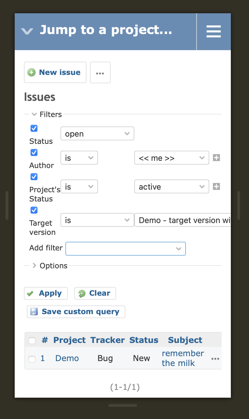
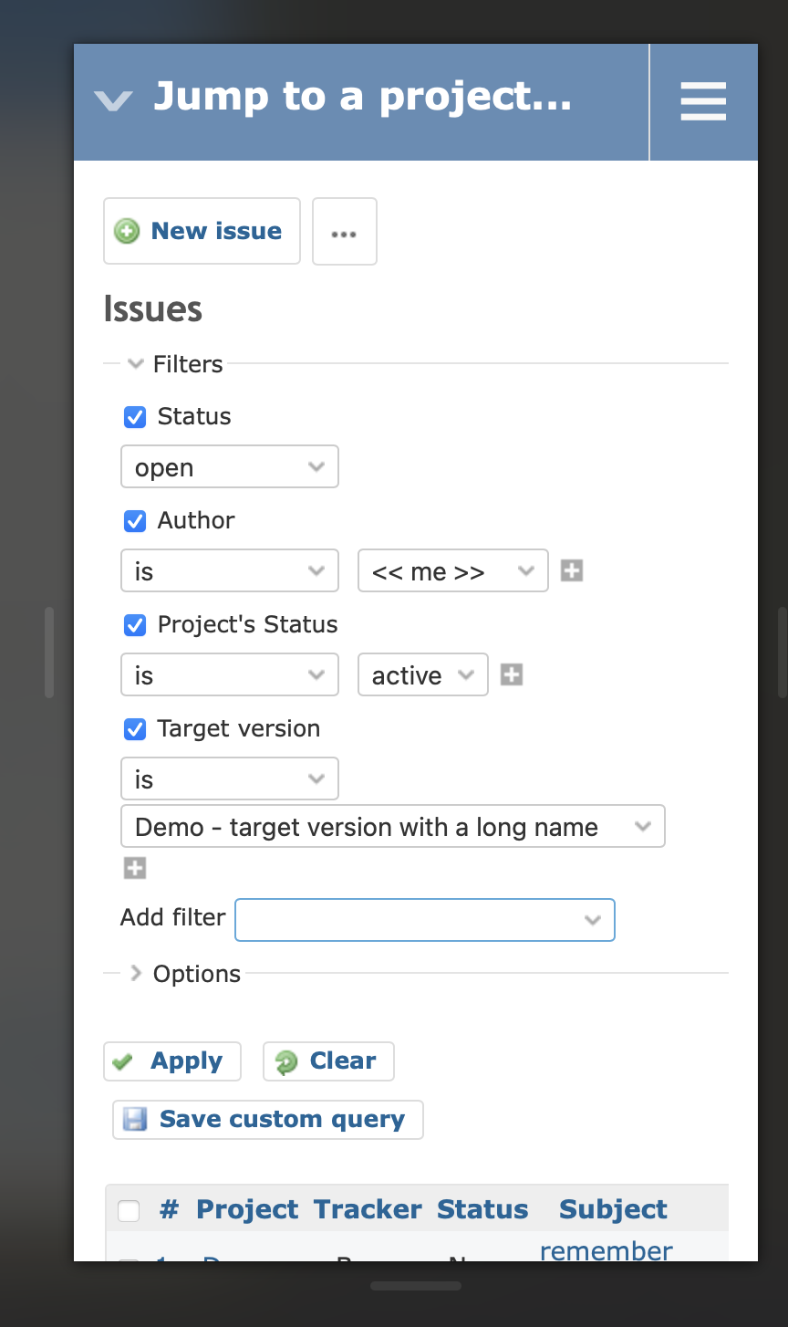
The current query filters and options use HTML tables for the layout, which introduces issues with wide form elements on narrow screens.
The attached patch which was extracted from Planio replaces the layout tables with a flex layout. The look and feel in desktop browsers should stay unchanged, but on narrow screens like mobile phones filter rows that previously just exceeded the screen width will now wrap to a new row.
Files
Related issues
 Updated by Jens Krämer over 2 years ago
- File 0001-replaces-query-filters-and-option-tables-with-a-flex.patch 0001-replaces-query-filters-and-option-tables-with-a-flex.patch added
here's the patch :)
Also: this change has the potential to break plugins which use the changed partials and rely on the old table markup in their stylesheets or Javascript.
 Updated by Marius BĂLTEANU over 2 years ago
- Tracker changed from Patch to Feature
- Subject changed from Improve filter rendering on narrow screens to Improve filter rendering on narrow screens by replacing the layout tables with a flex layout
- Status changed from New to Resolved
- Assignee set to Marius BĂLTEANU
- Resolution set to Fixed
Committed, thanks!
Updated by Marius BĂLTEANU over 2 years ago
Updated by Marius BĂLTEANU over 2 years ago
- Status changed from Resolved to Closed
 Updated by Mizuki ISHIKAWA over 2 years ago
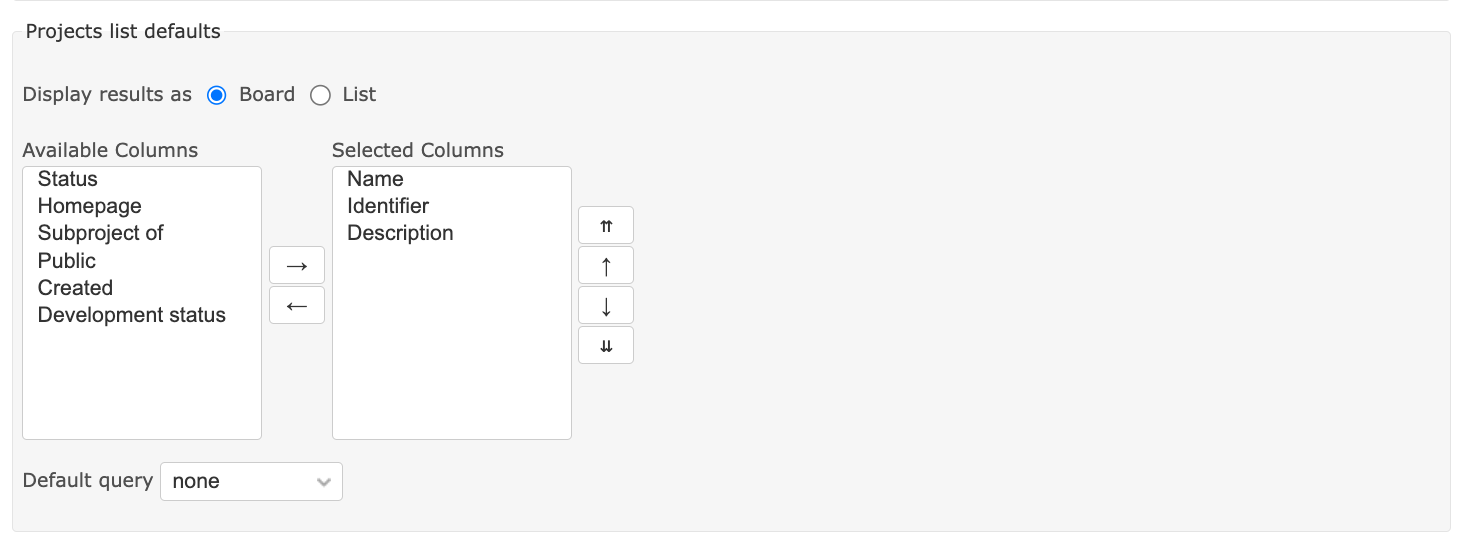
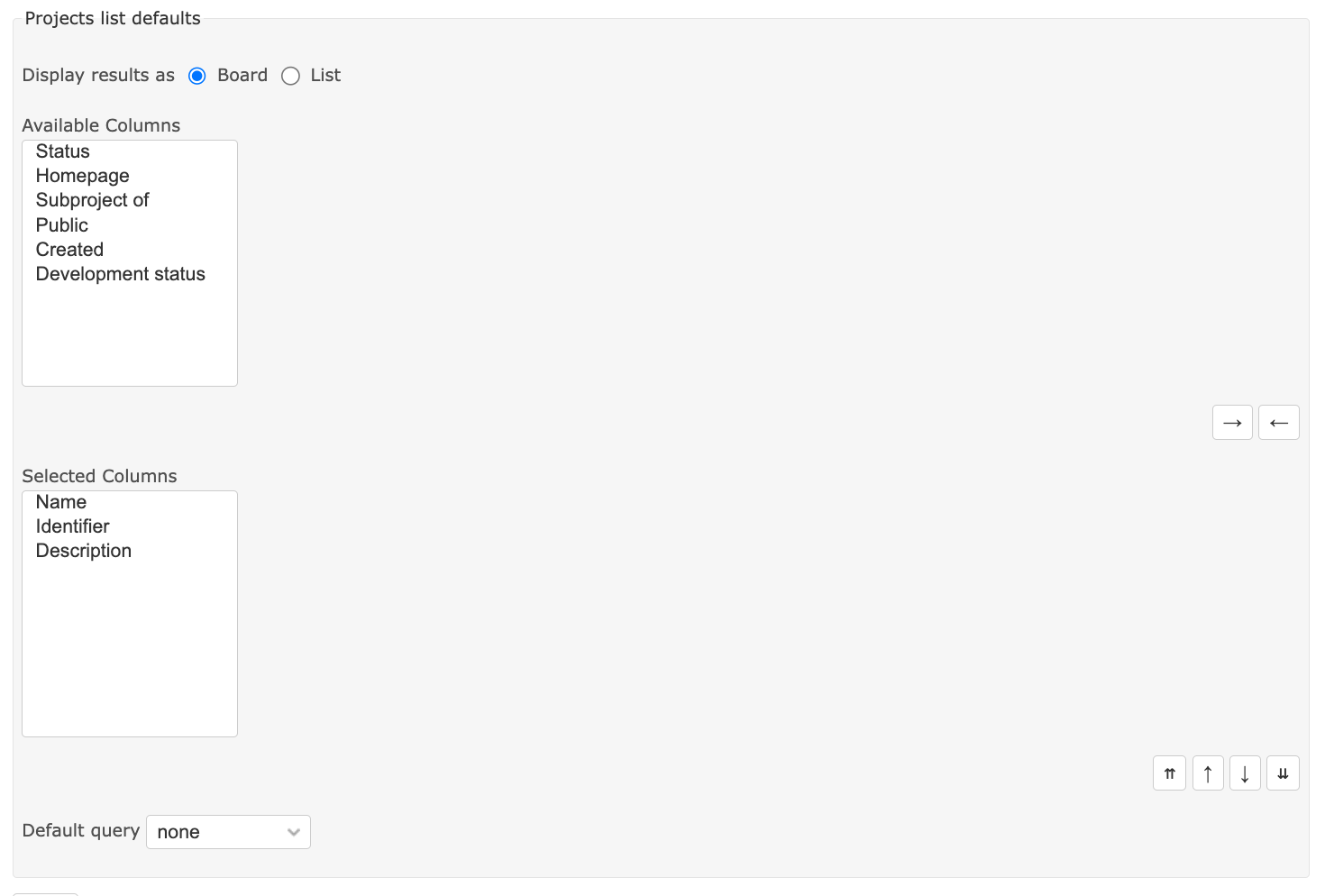
- File actual.png actual.png added
- File expected.png expected.png added
Where the problem occurs:
- Administration => Settings => Projects tab => Projects list defaults
- Administration => Settings => Projects tab => Issues list defaults
- My page => Add: Reported issues => Click setting icon
| Expected | Actual |
 |
 |
Updated by Jens Krämer over 2 years ago
- File 0001-fix-query-columns-selection-in-admin-and-my-page-398.patch 0001-fix-query-columns-selection-in-admin-and-my-page-398.patch added
- File 0002-whitespace.patch 0002-whitespace.patch added
attached is a patch that fixes the layout in all three places. second patch for whitespace / indentation.
Updated by Mizuki ISHIKAWA over 2 years ago
Jens Krämer wrote in #note-8:
attached is a patch that fixes the layout in all three places. second patch for whitespace / indentation.
Thank you for fixing the problem so quickly! After applying the patch, I was able to verify that the problem was fixed on the three reported screens.
I found a problem with "Administration => Settings => Time tracking tab => Timelog list defaults" as well. Sorry I didn't report it first.
Updated by Mizuki ISHIKAWA over 2 years ago
- File 0003-fix-query-columns-selection-in-admin-time-tracking-settings.patch 0003-fix-query-columns-selection-in-admin-time-tracking-settings.patch added
I fixed the issue with the Time tracking tab with reference to the patch in #note-8.
Updated by Marius BĂLTEANU over 2 years ago
All three patches committed, thank you for reporting and fixing those issues so quickly.
Updated by Mizuki ISHIKAWA over 2 years ago
- File 0004-fix-query-columns-selection-in-custom-query-form.patch 0004-fix-query-columns-selection-in-custom-query-form.patch added
Thank you for your commit. I found one more same problem and fixed it.
Updated by Marius BĂLTEANU over 2 years ago
Mizuki ISHIKAWA wrote in #note-12:
Thank you for your commit. I found one more same problem and fixed it.
Thanks, committed.
 Updated by Takashi Kato 18 days ago
As a result of the changes in this revision, the column selection toggle does not work properly.
The attached patch fix this issue.
Updated by Marius BĂLTEANU 18 days ago
- Related to Defect #44170: Toggling between board and list in projects query do not work properly added