Feature #40744
closed
Refresh history tabs look and feel
Description
The current UI of the history tab looks quite confusing because of the many borders. For some heading we started to add a background color (ex: Activity page) and I think we should also add to the history tab. Looking on some active themes, I saw some quite nice implementations:
1.Simple change to show gravatar inside the heading:
2. From redmine_theme_farend_bleuclair theme maintained by Farend (Go MAEDA).
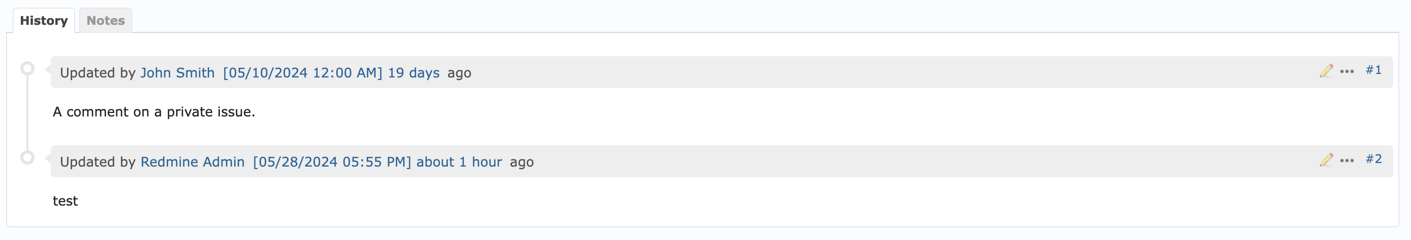
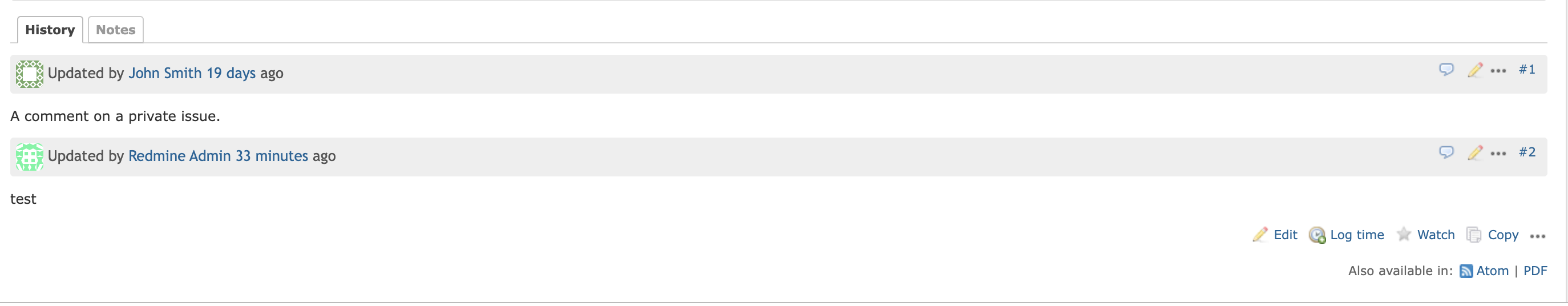
Final version implemented:
Issue: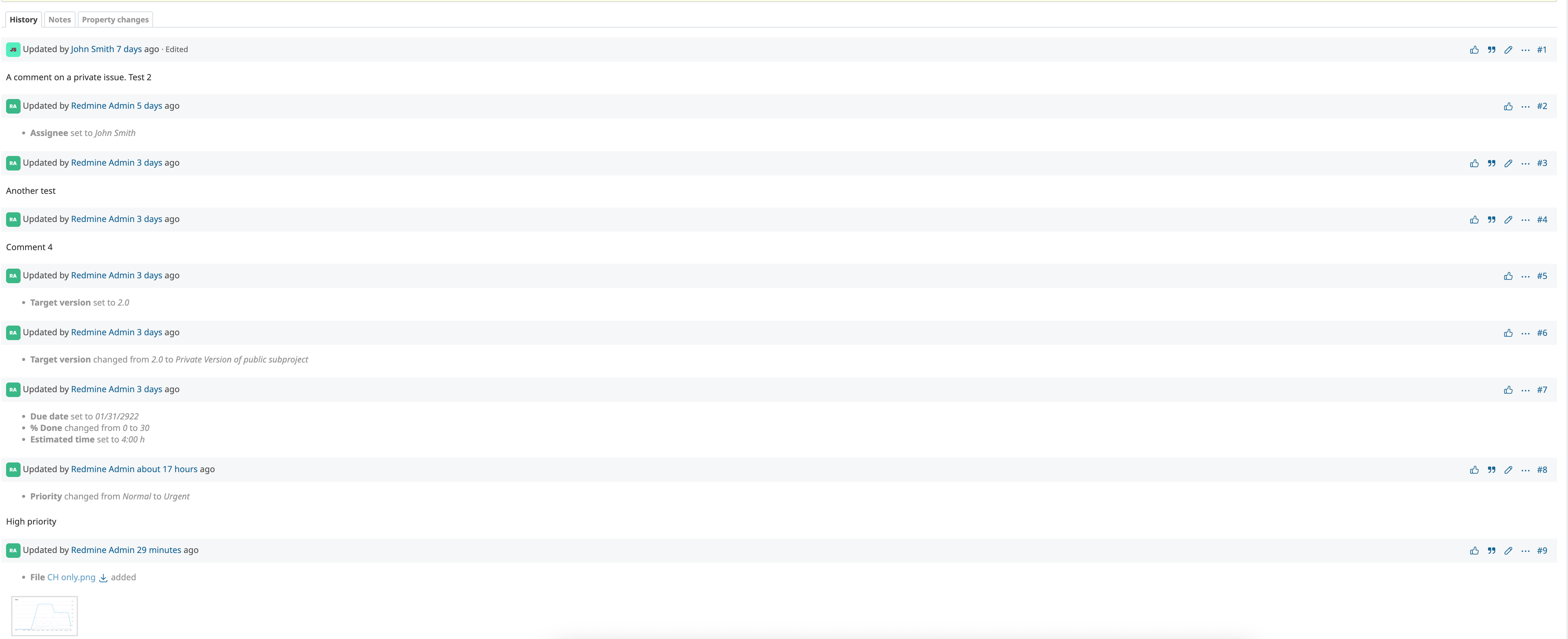
News: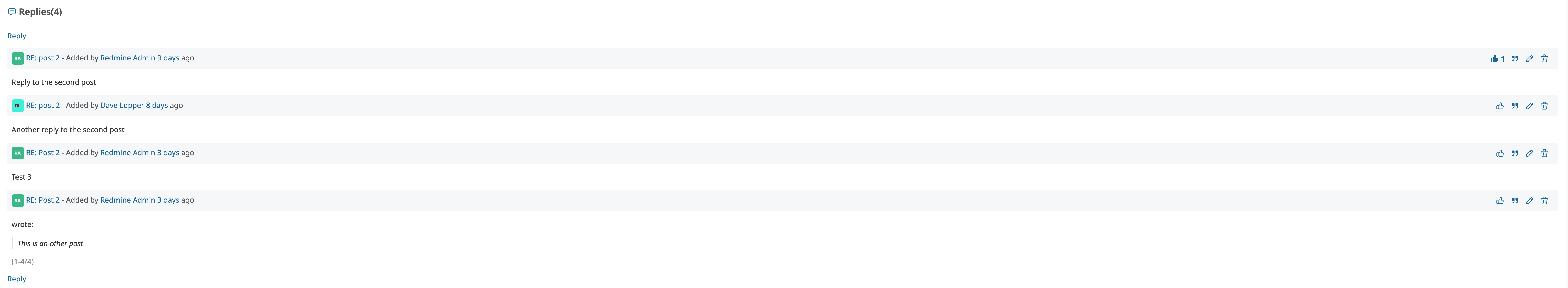
Forum:
Files
Related issues
 Updated by Marius BĂLTEANU about 2 years ago
Also, this should cover also the requirements from #39880.
Updated by Marius BĂLTEANU about 2 years ago
- Related to Feature #39882: Highlight selected version on the Roadmap view added
Updated by Marius BĂLTEANU about 2 years ago
- Related to deleted (Feature #39882: Highlight selected version on the Roadmap view)
Updated by Marius BĂLTEANU about 2 years ago
- Related to Feature #39880: Add a small border-radius to selected (author) headings added
 Updated by Mizuki ISHIKAWA about 2 years ago
I like design 2 and usually use the Bleuclair theme. When displaying an icon image with design 2, it looks like a speech bubble appears from the icon image as shown in the screenshot below.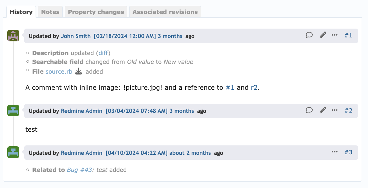
design 1 is also easier to read than at present. I prefer a little more padding.
 Updated by Go MAEDA about 2 years ago
Thank you for your interest in the Bleuclair theme. It was created by Junichi Ishikura and is now maintained by Mizuki ISHIKAWA.
I believe the readability of the Bleuclair theme's history tab is nicer than the default theme, and I would be happy to see it incorporated into Redmine core.
Updated by Marius BĂLTEANU about 2 years ago
Thanks for your responses.
Mizuki ISHIKAWA, Go MAEDA, do you think it is possible to extract this into a patch and post it here? I can review it.
Updated by Mizuki ISHIKAWA about 2 years ago
- File feature-40744-bleuclair-v1.patch feature-40744-bleuclair-v1.patch added
- File screenshot 2024-06-06 16.02.14.png screenshot 2024-06-06 16.02.14.png added
- File screenshot 2024-06-06 16.02.00.png screenshot 2024-06-06 16.02.00.png added
- File screenshot 2024-06-06 16.01.09.png screenshot 2024-06-06 16.01.09.png added
Marius BĂLTEANU wrote in #note-7:
Thanks for your responses.
Mizuki ISHIKAWA, Go MAEDA, do you think it is possible to extract this into a patch and post it here? I can review it.
I made a patch. I'm not very good at writing CSS, so feedback is welcome.
I have also applied changes to similar layout such as the news and forum screens.
The vertical line connecting the icons is hidden in the notes tab and properties tab. This is because notes and properties are considered to be extracted from a part of the continuous history and are therefore discontinuous.
| issue | forum | news |
|---|---|---|
 |
 |
 |
Updated by Mizuki ISHIKAWA about 2 years ago
Slightly modified patch.
Updated by Go MAEDA over 1 year ago
- Target version set to Candidate for next major release
Updated by Marius BĂLTEANU about 1 year ago
- File timeline.png timeline.png added
- File background header.png background header.png added
- File border.png border.png added
Thanks for posting the patches.
Based on the existing work, I made 3 options:
Option 1: timeline and border with background for header only for journal with notes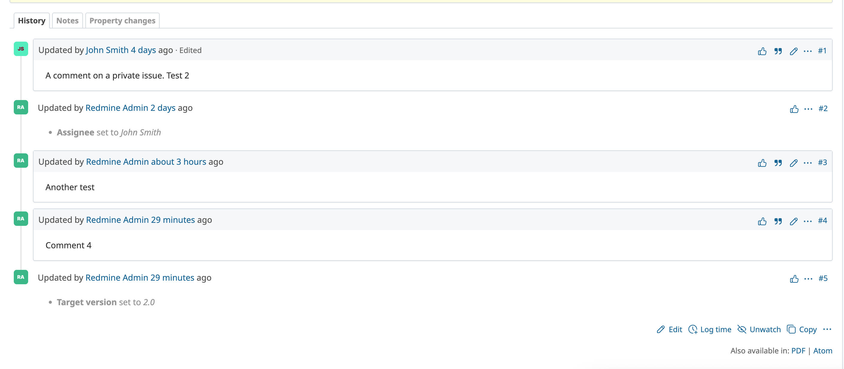
Option 2: only background for node header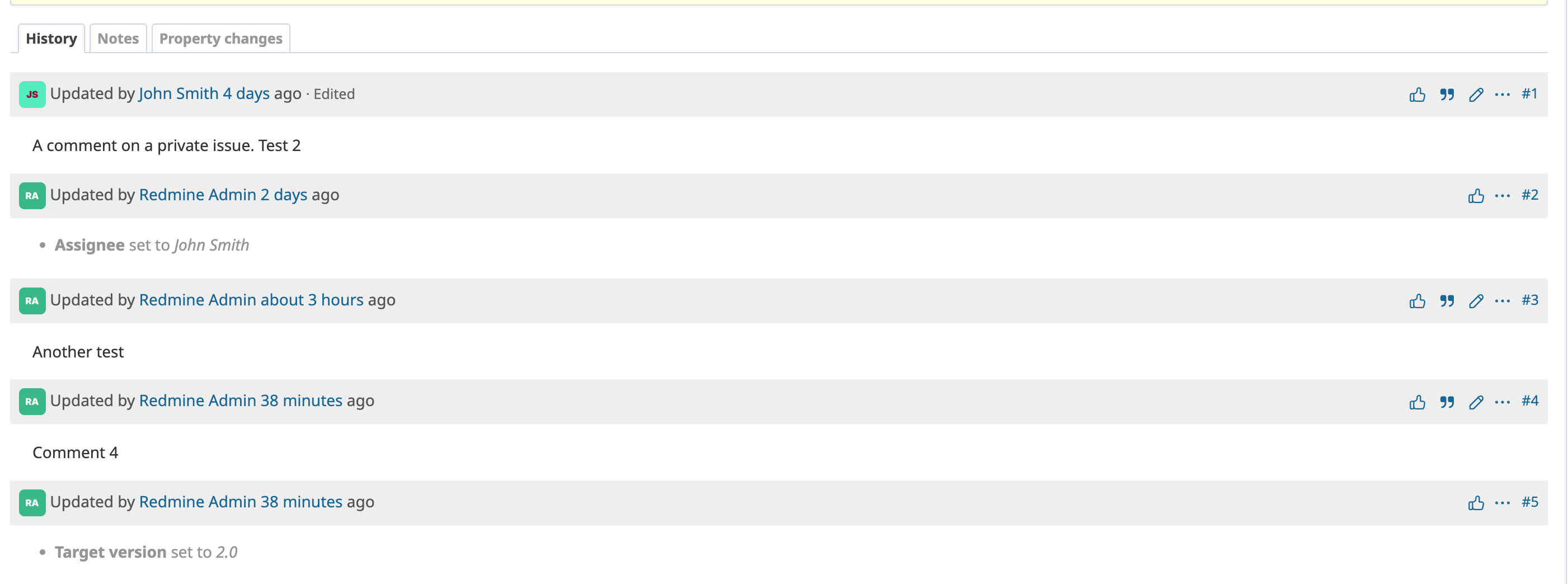
Option 3: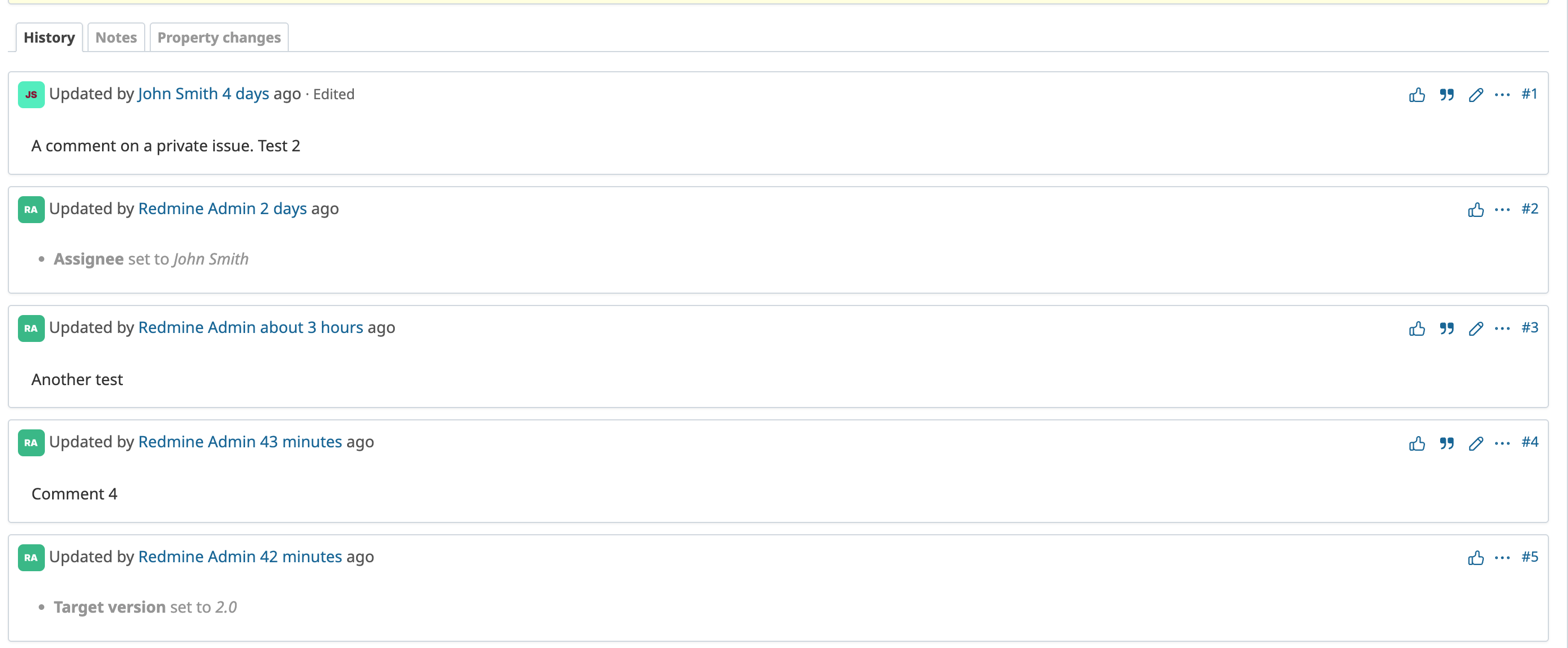
What do you think?
Updated by Go MAEDA about 1 year ago
Thank you for putting together these options.
I prefer Option 2 or Option 3. I don't like Option 1 because journals without notes look different and are less noticeable. This might cause people to miss important information. Also, the appearance feels a bit strange. If someone isn't interested in journals without notes, they can just switch to the "Notes" tab. So, I don't think we need to change the way it looks.
Updated by Marius BĂLTEANU about 1 year ago
- File forum-comments.png forum-comments.png added
- File news-replies.png news-replies.png added
- File issue-notes.png issue-notes.png added
- File 0001-Unify-the-look-and-feel-of-issue-notes-news-replies-.patch added
- Target version changed from Candidate for next major release to 6.1.0
Thanks Go MAEDA for your feedback.
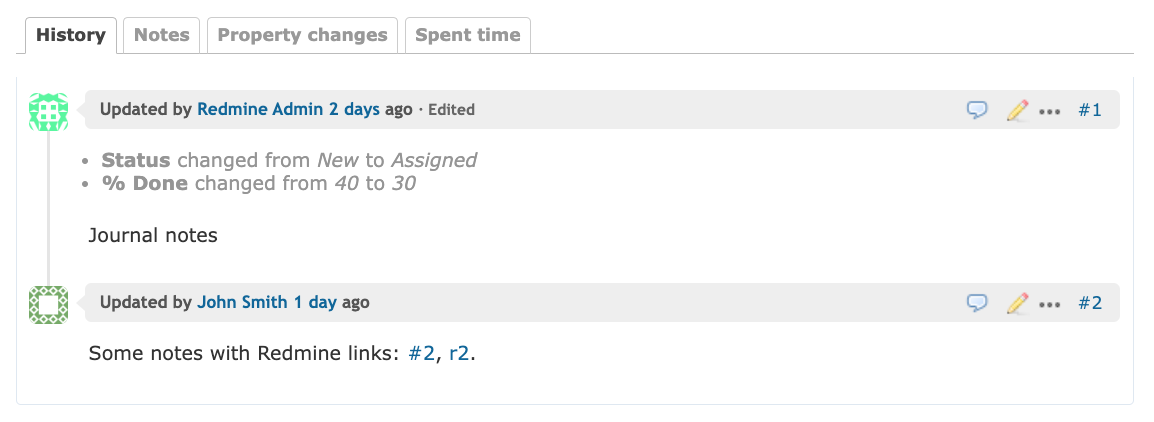
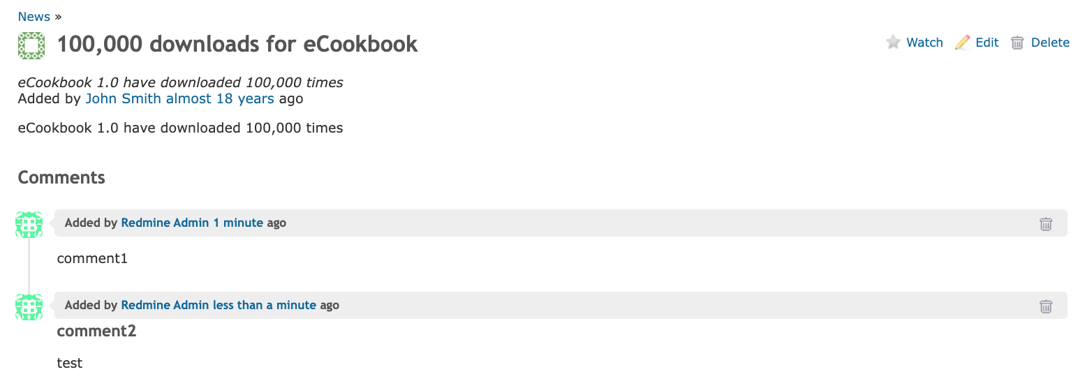
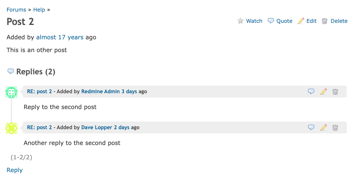
Attached is my final version based on option 2, but with some changes:- I unified the HTML structure of issue notes, news replies and forum comments by introducing new classes:
events,event-item,event-header,event-details,event-actionsandevent-content. - I used a lighter color (#f6f7f8) as a background color for event headers
- I migrated the journal actions from contextual to flex rules
I'm still not 100% happy wit the results, but I think that it is better than the actual version.
Any feedback is welcome!
Updated by Marius BĂLTEANU about 1 year ago
- File deleted (
0001-Unify-the-look-and-feel-of-issue-notes-news-replies-.patch)
Updated by Marius BĂLTEANU 12 months ago
- Related to Patch #42972: Refactor and unify the structure of journals, replies and comments added
Updated by Marius BĂLTEANU 12 months ago
- Description updated (diff)
- Status changed from Resolved to Closed
Updated by Mizuki ISHIKAWA 12 months ago
I would prefer .journal instead of .journal-entry to unify with issues and forums.
diff --git a/app/views/news/show.html.erb b/app/views/news/show.html.erb
index f80af8f18..704d3d04e 100644
--- a/app/views/news/show.html.erb
+++ b/app/views/news/show.html.erb
@@ -41,7 +41,7 @@
   <p><%= toggle_link l(:label_comment_add), "add_comment_form", :focus => "comment_comments", :scroll => "comment_comments" %></p>
 <% end %>
 <% @comments.each do |comment| %>
-    <div class="message reply journal-entry" id="<%= "message-#{comment.id}" %>">
+    <div class="message reply journal" id="<%= "message-#{comment.id}" %>">
       <% next if comment.new_record? %>
       <h4 class="reply-header journal-header">
         <span class="journal-info">
Updated by Marius BĂLTEANU 12 months ago
Mizuki ISHIKAWA wrote in #note-18:
I would prefer .journal instead of .journal-entry to unify with issues and forums.
[...]
Committed the fix, thanks for pointing this out!
Updated by Go MAEDA 10 months ago
- Related to Feature #43221: Unify Activity date header color with the issue journal header added
Updated by Marius BĂLTEANU 9 months ago
- Related to Feature #31573: Show each journal entry from issue history in a box added